TROOH puts digital screens on campuses, in salons and in barbershops. We built the brand system that ties all three networks to one name.
- Brand architecture
- Logo master
- Colour palette
- Stationery
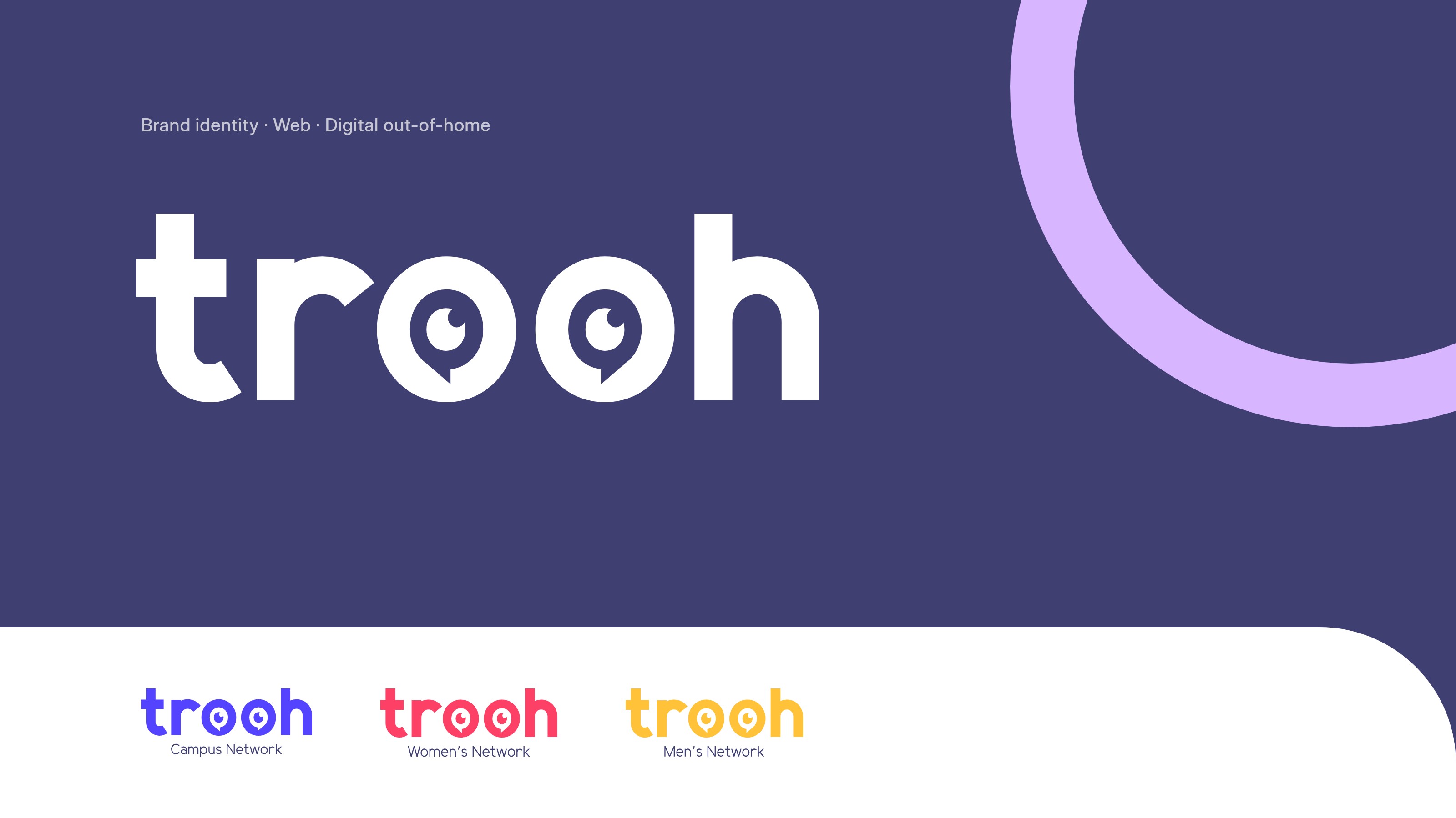
TROOH puts digital screens on campuses, in salons and in barbershops. We built the brand system that ties all three networks to one name.
TROOH sells three audiences: students, women in salons, men in barbershops. Each network needed its own presence. Advertisers still had to see one company behind all three.
We set the architecture first. One rounded wordmark leads. Campus, Women’s and Men’s lockups sit under it, each with a type-only version. Each network takes its own colour from one palette.
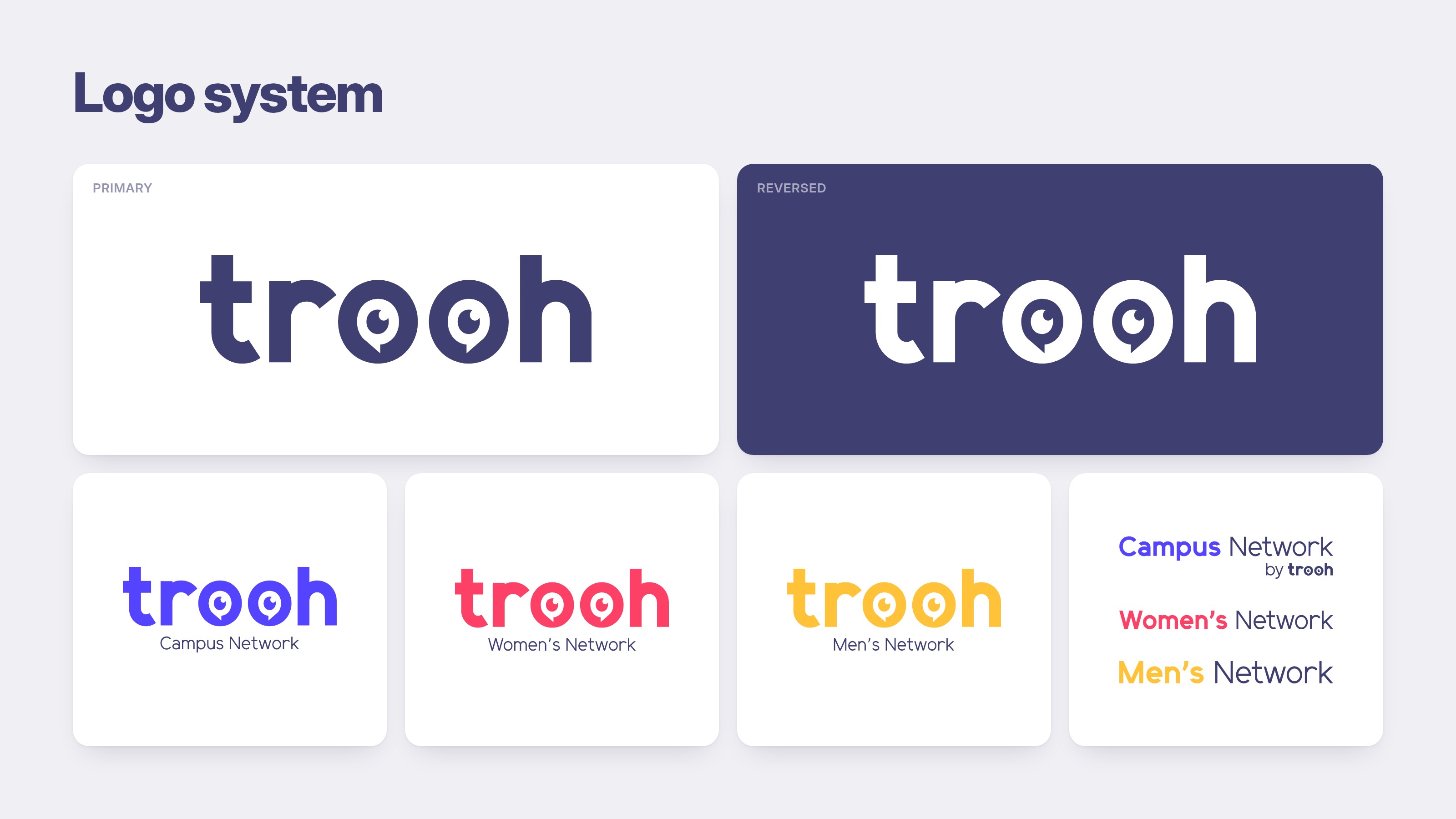
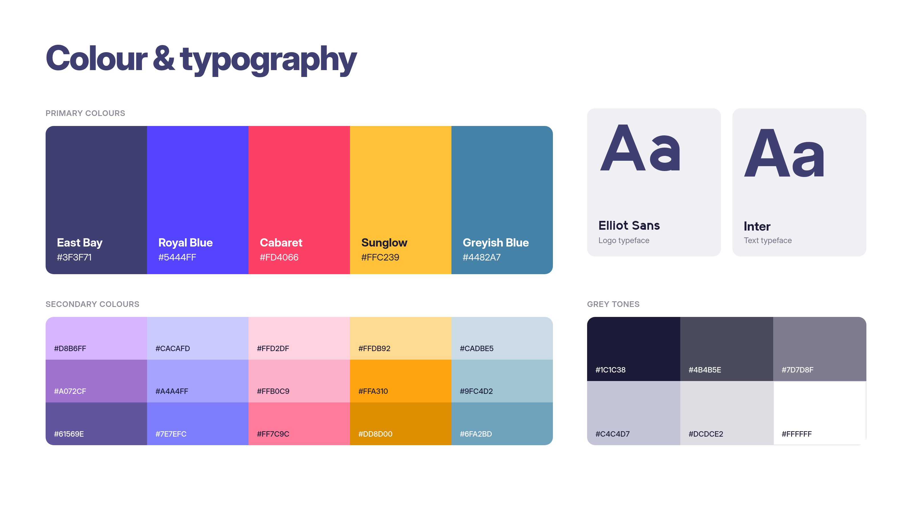
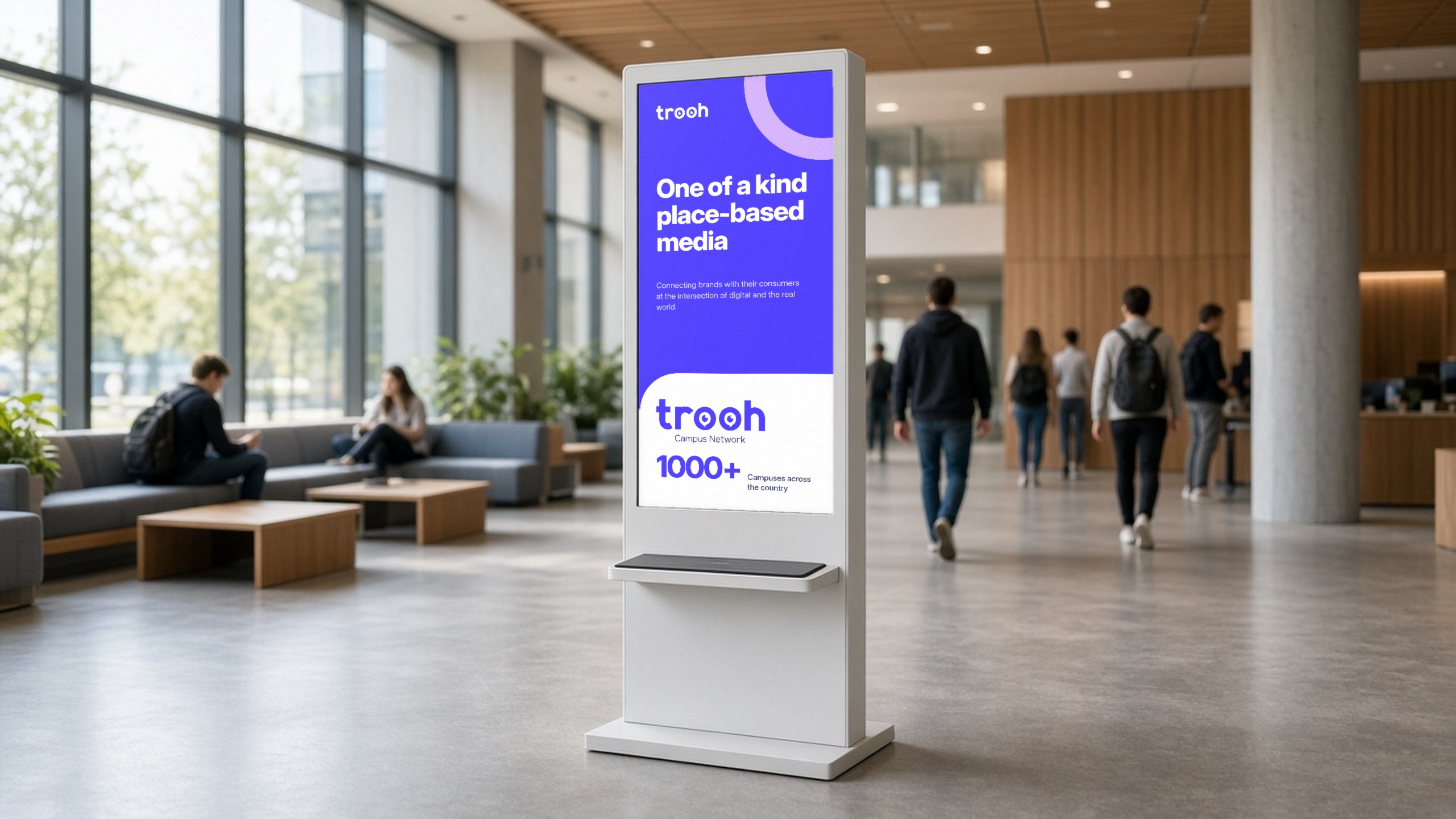
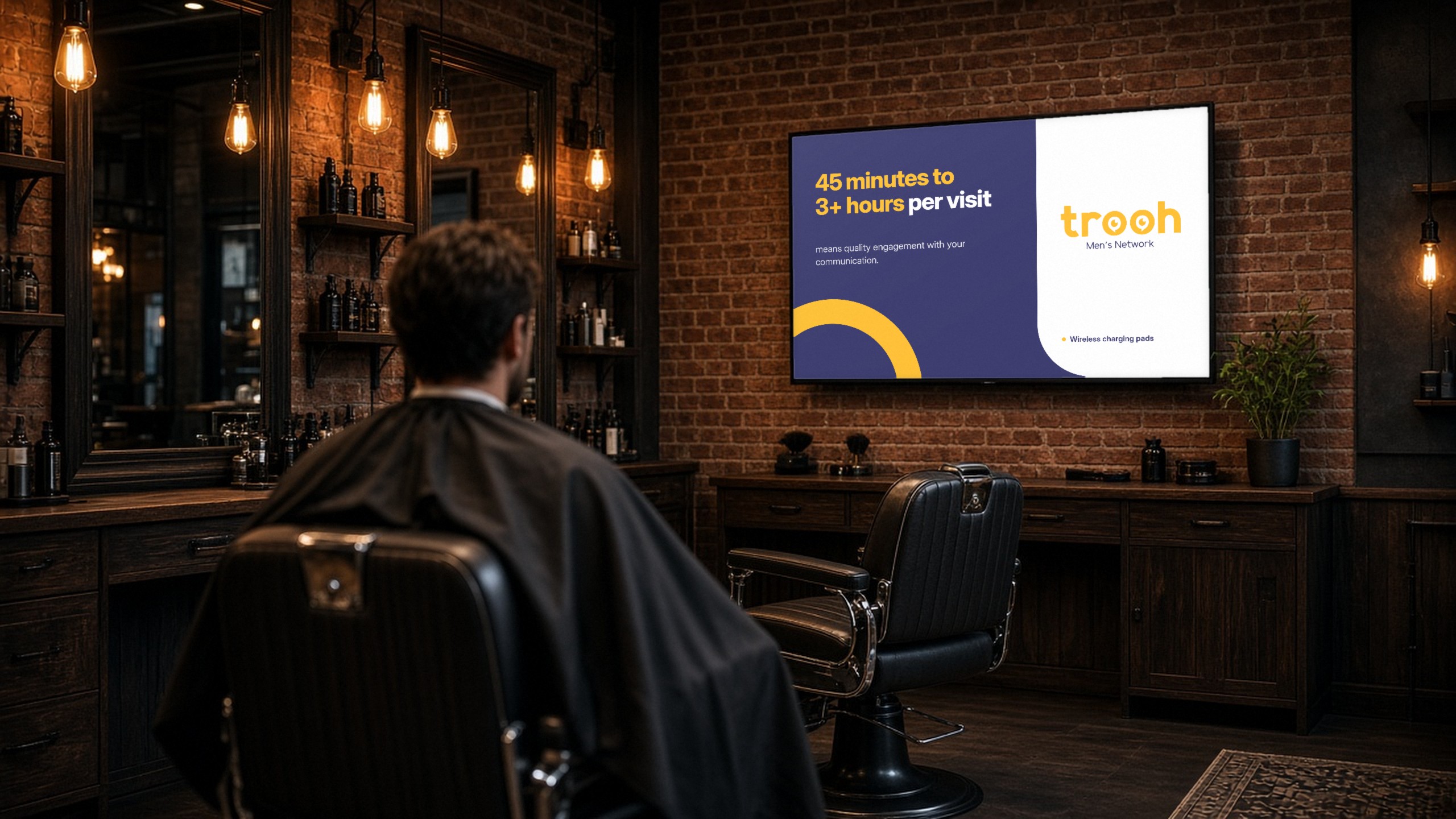
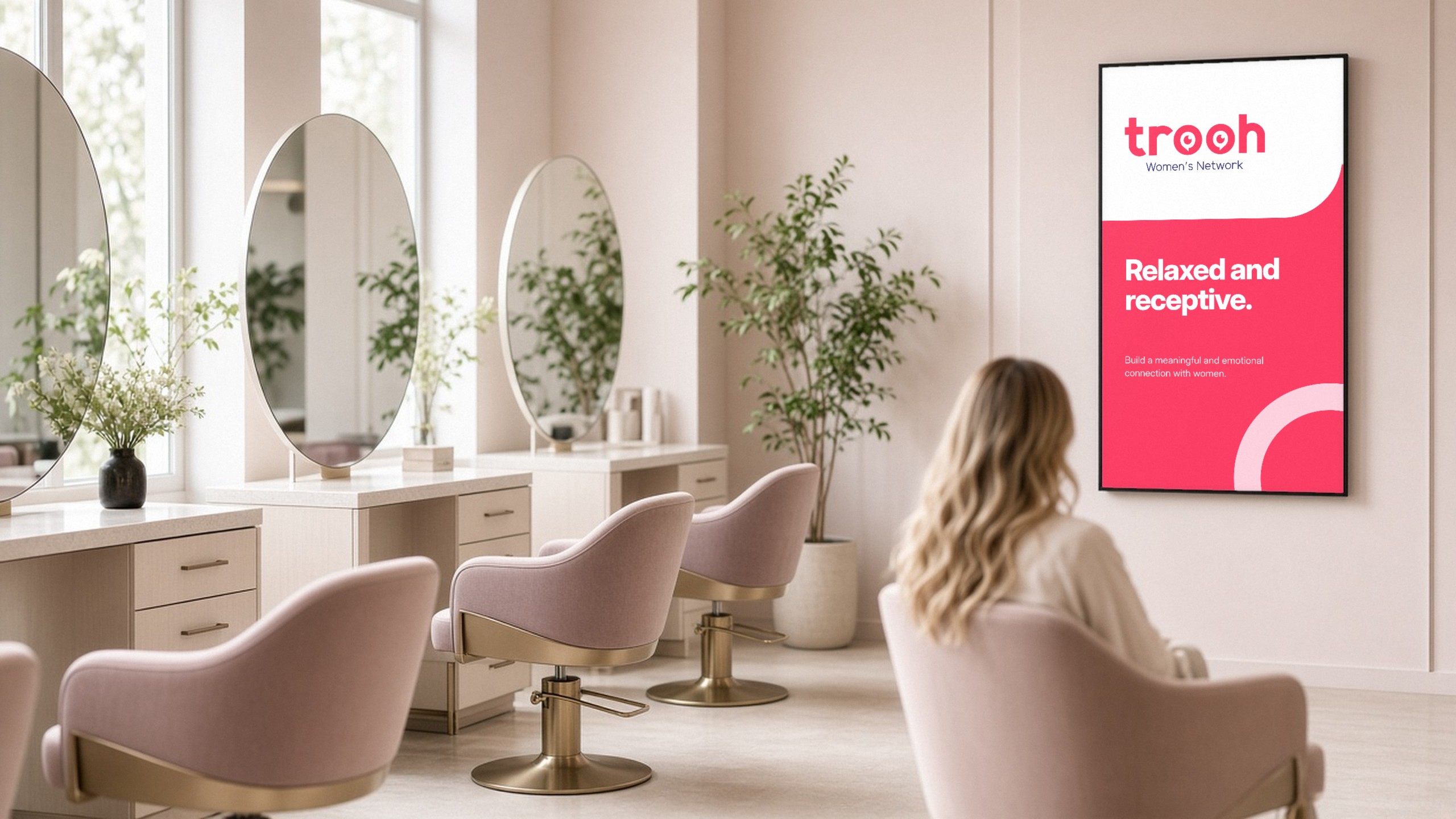
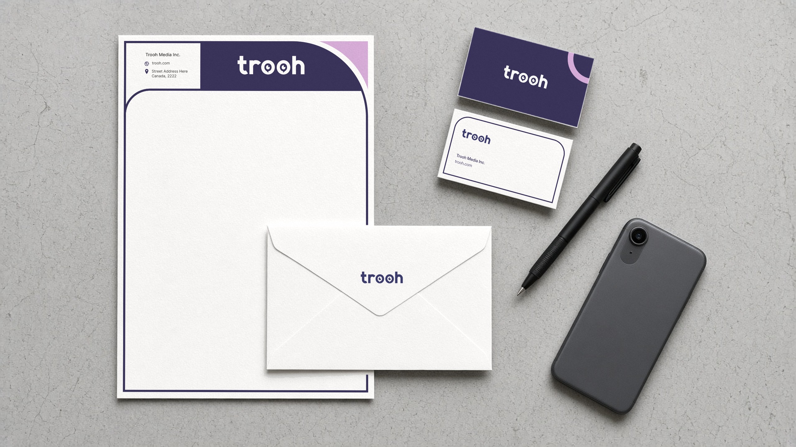
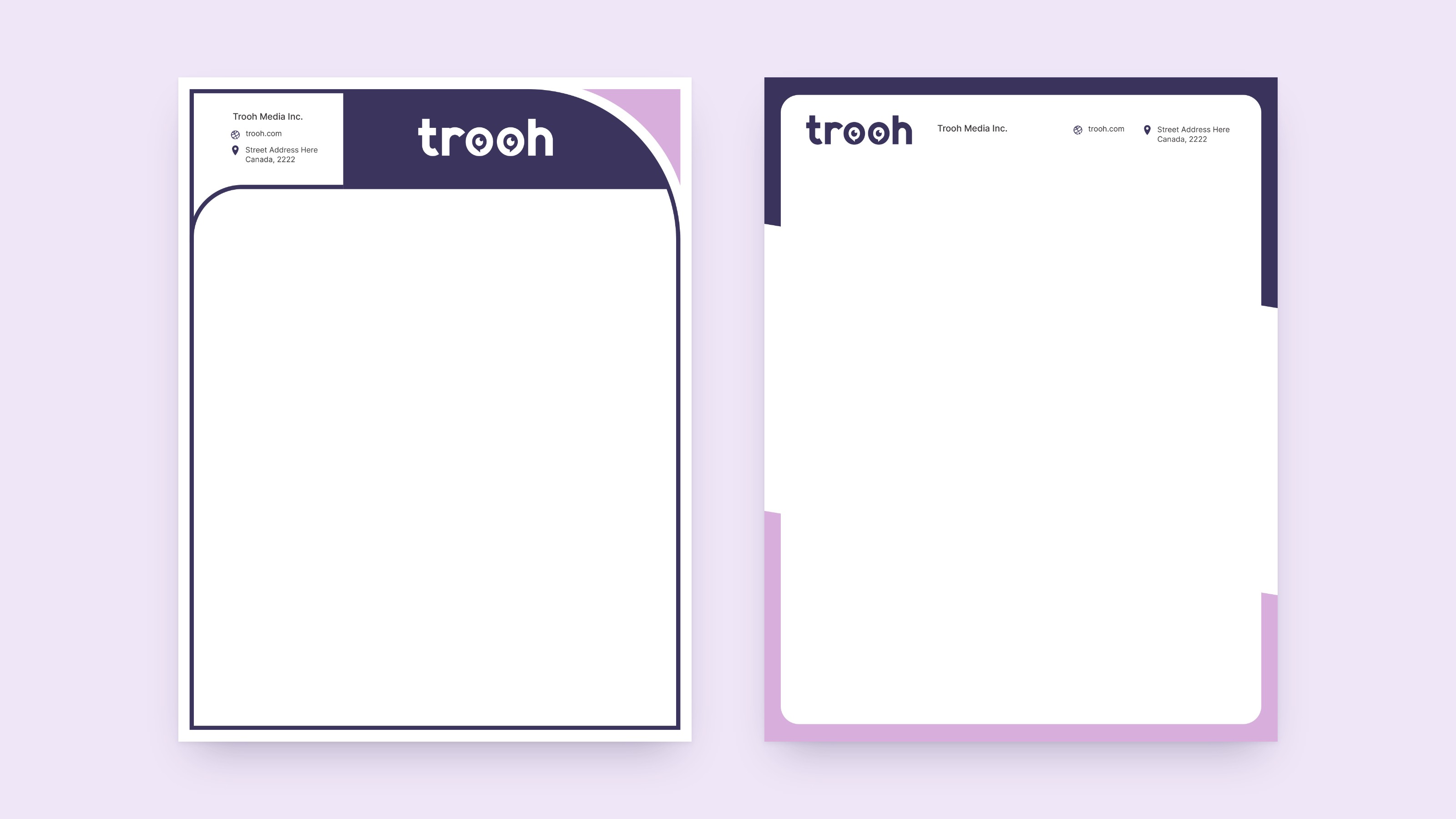
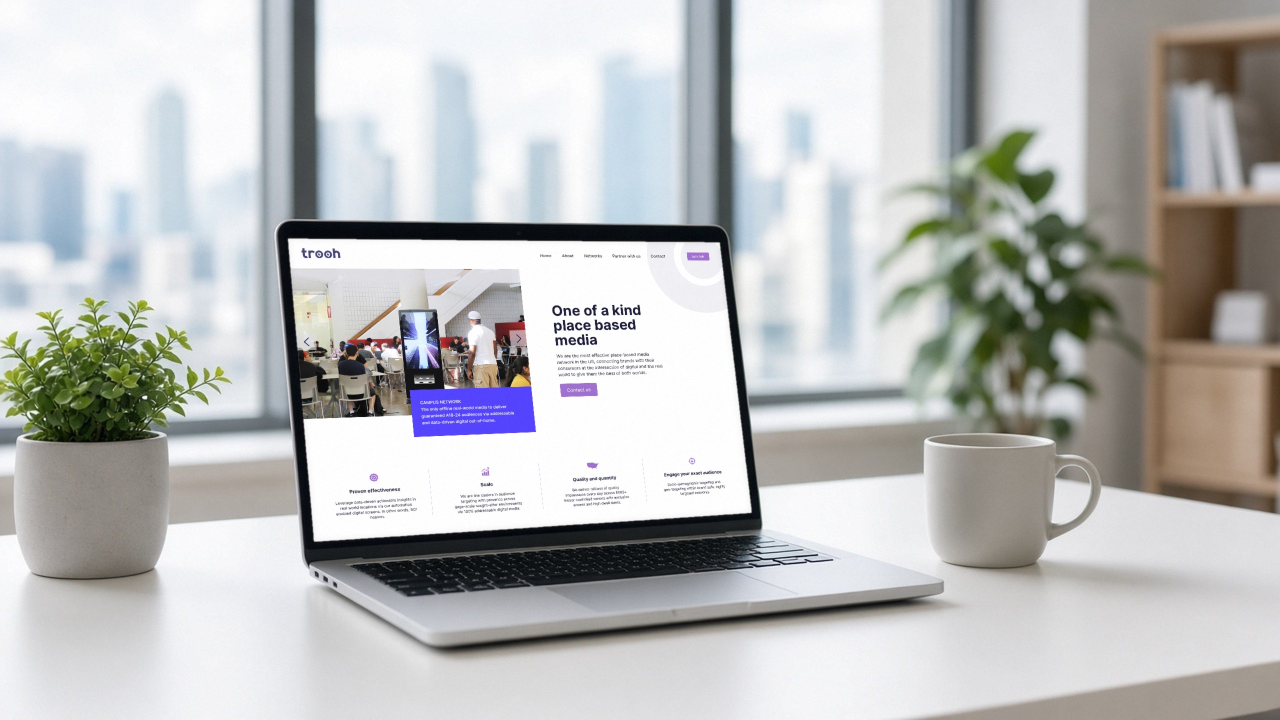
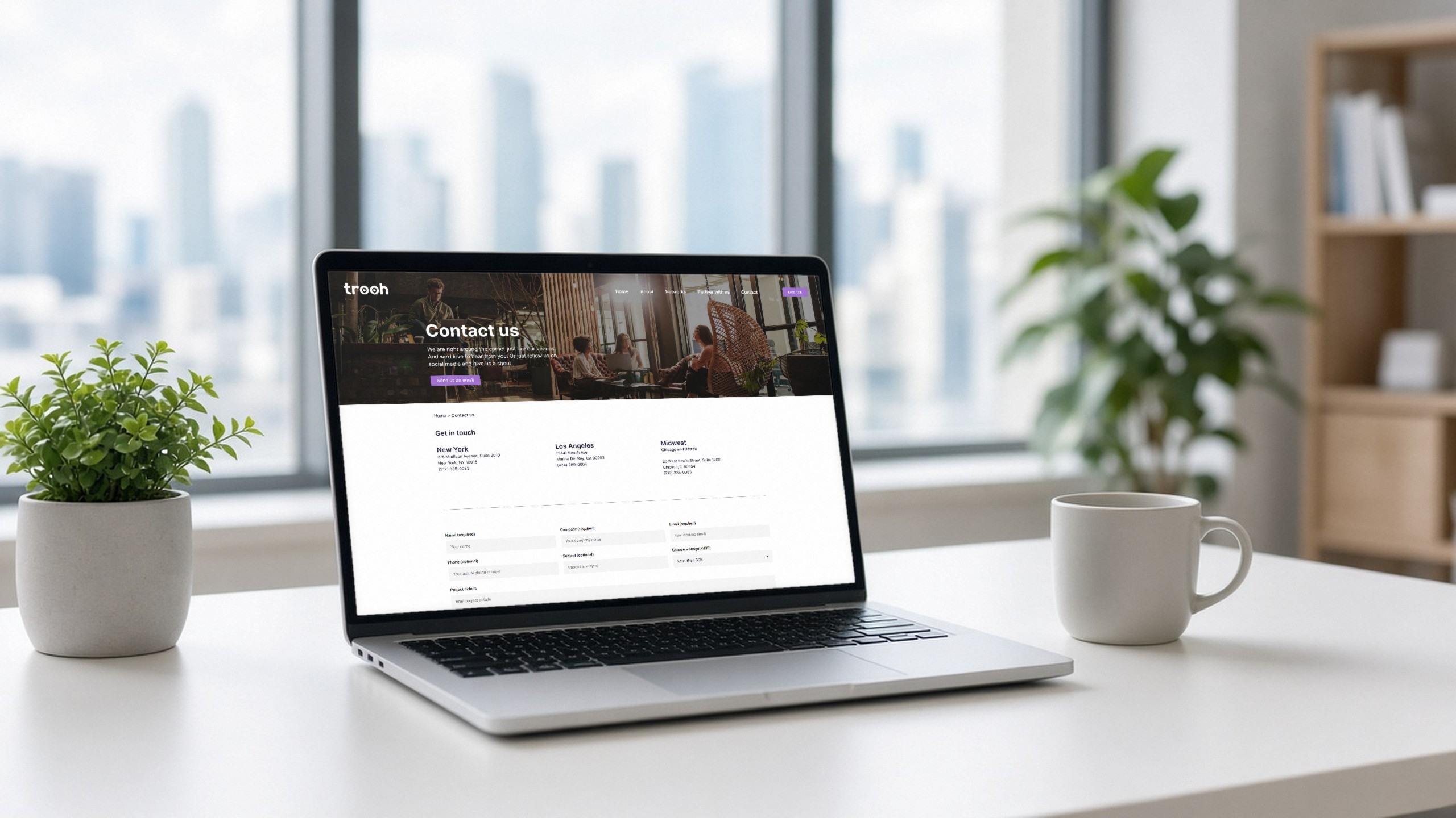
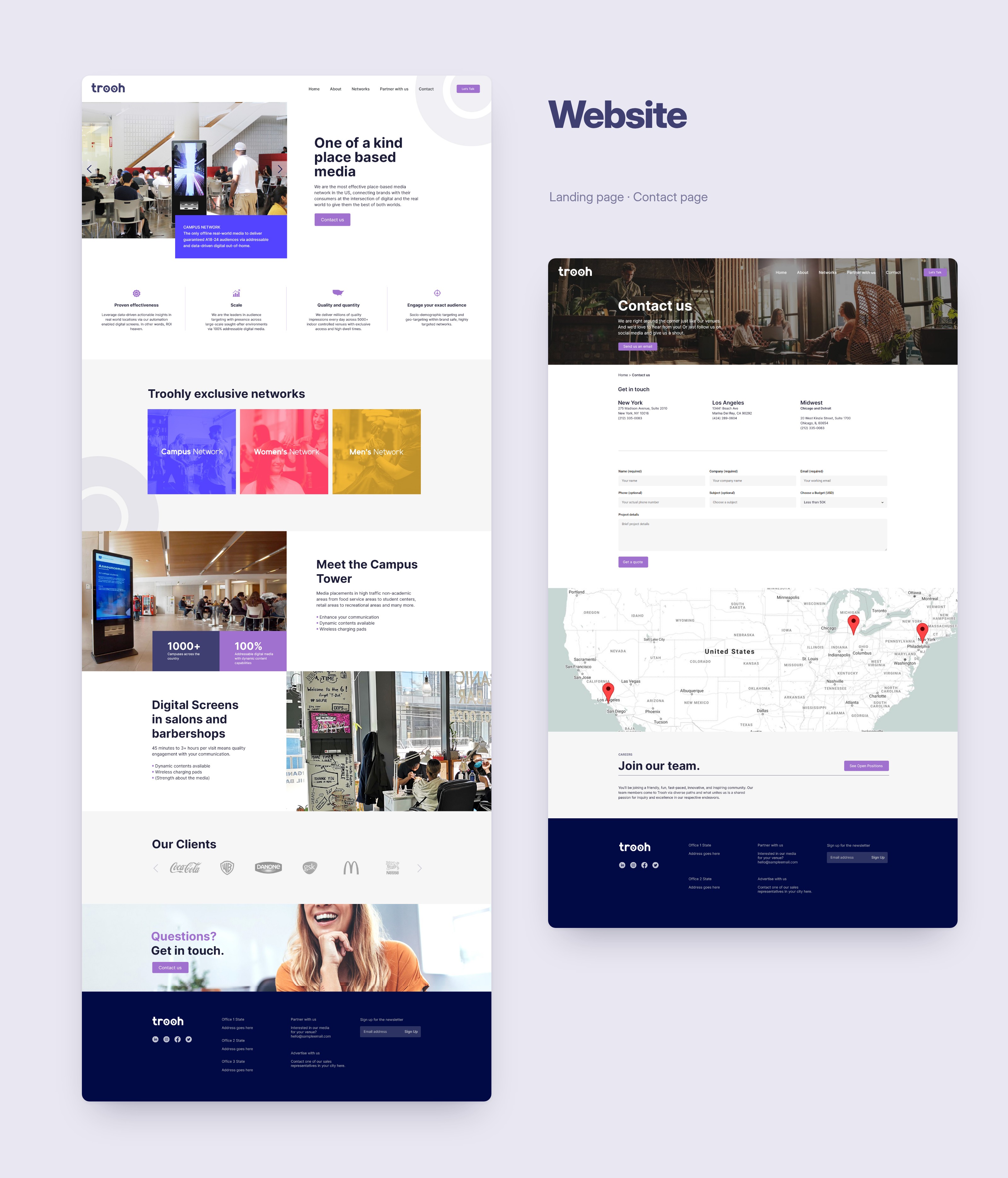
A logo master in CMYK and RGB, in every working format. Primary, secondary and grey palettes. Letterhead concepts. We also designed the landing and contact pages.
Every network reads as part of one company, on screen and on paper. One system covers the logo, colour, type and stationery.