Navigation
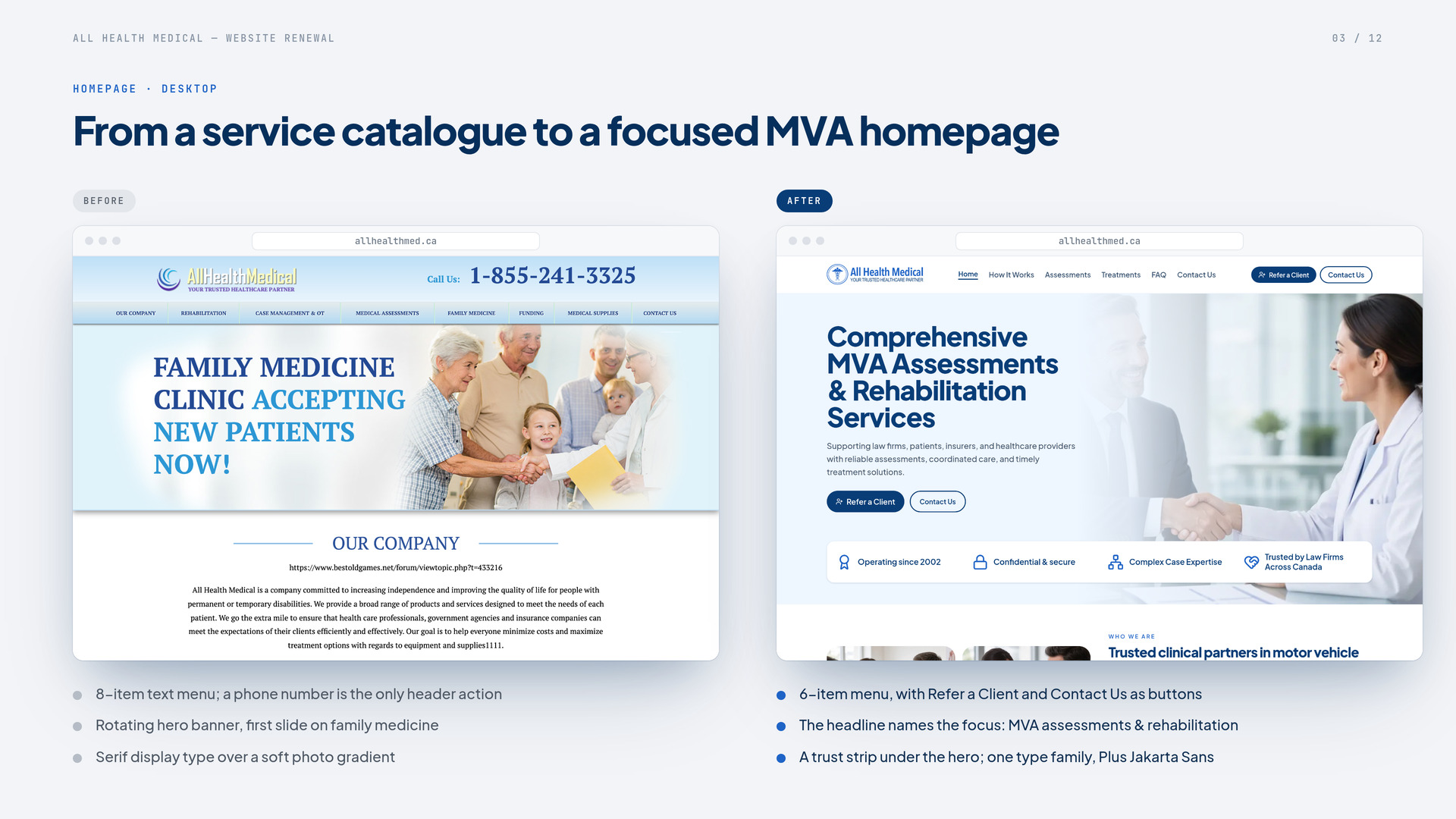
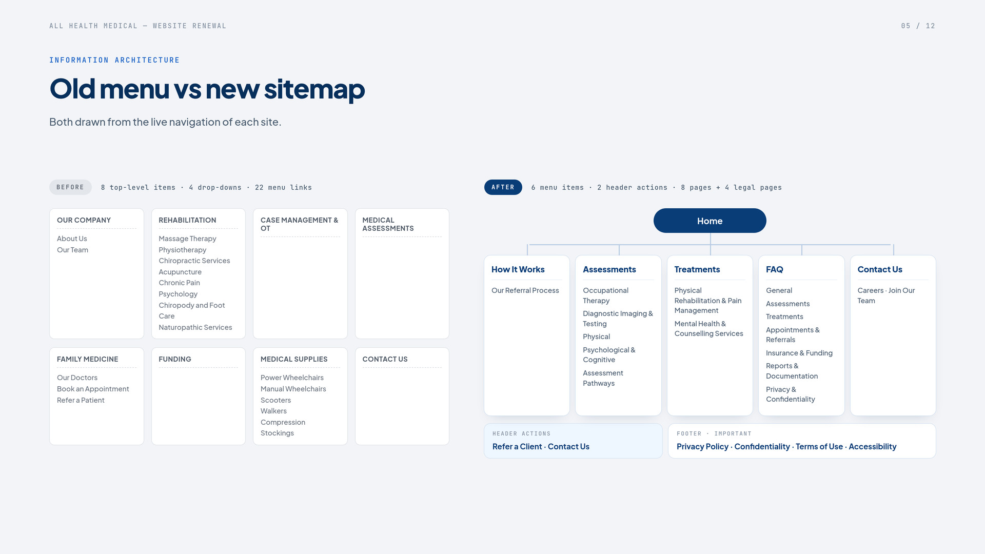
BeforeEight menu items with drop-downs covering rehab, family medicine, cardiac tests, funding and supplies.
AfterSix links, with Refer a Client and Contact Us as header buttons.

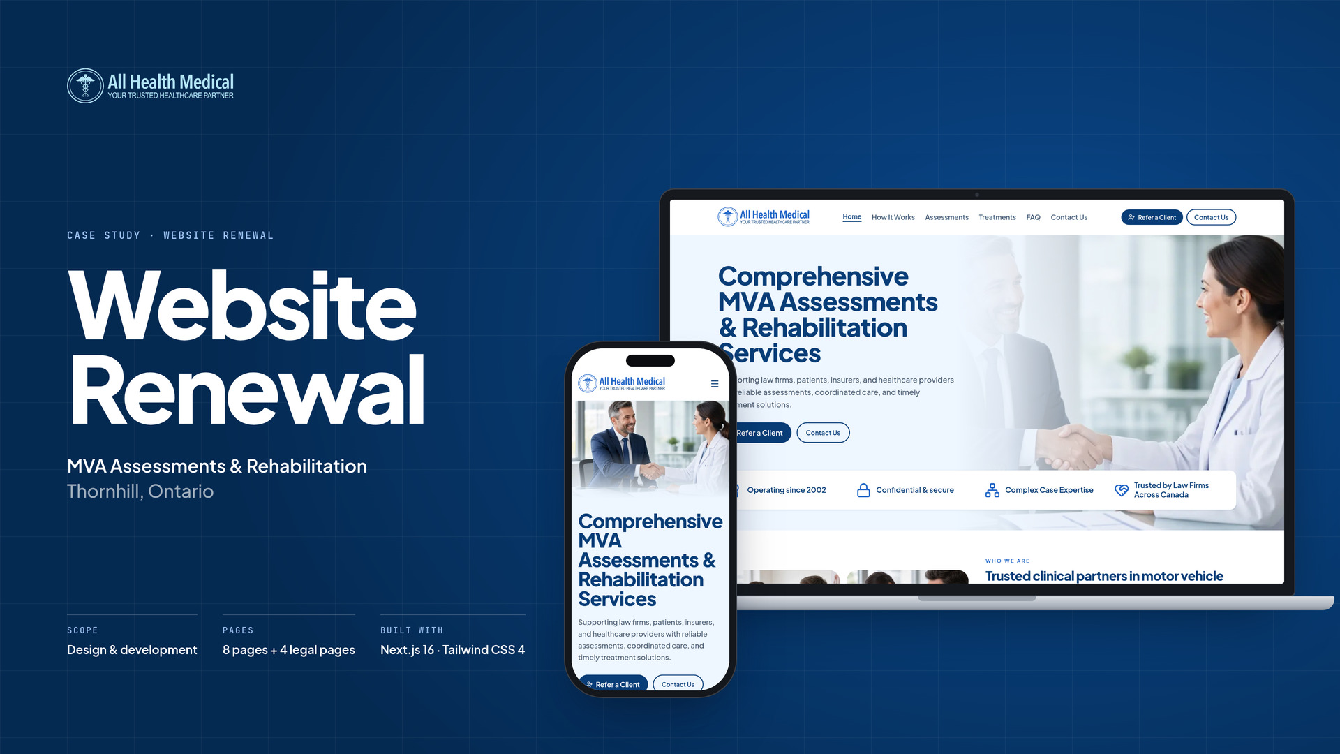
All Health Medical provides MVA assessments and rehab in Thornhill, Ontario. We redesigned and rebuilt its site around that work and the firms that refer clients.
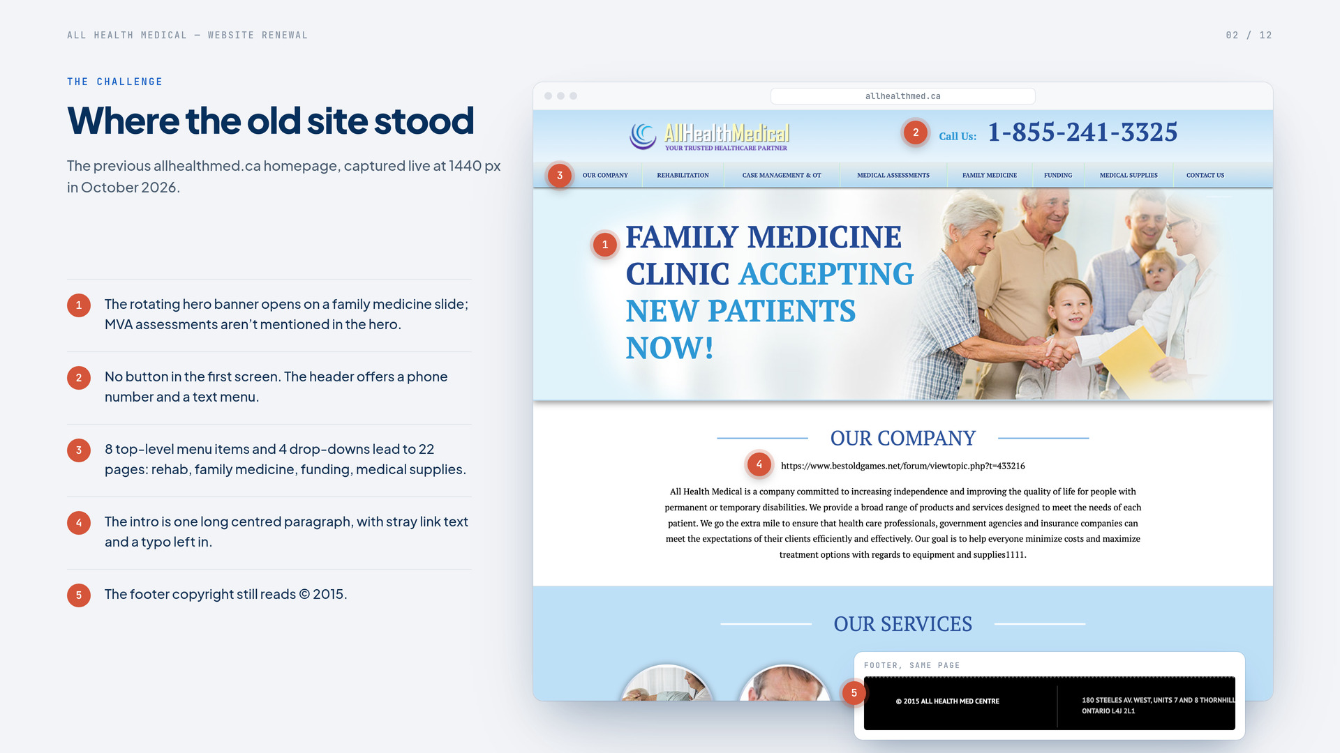
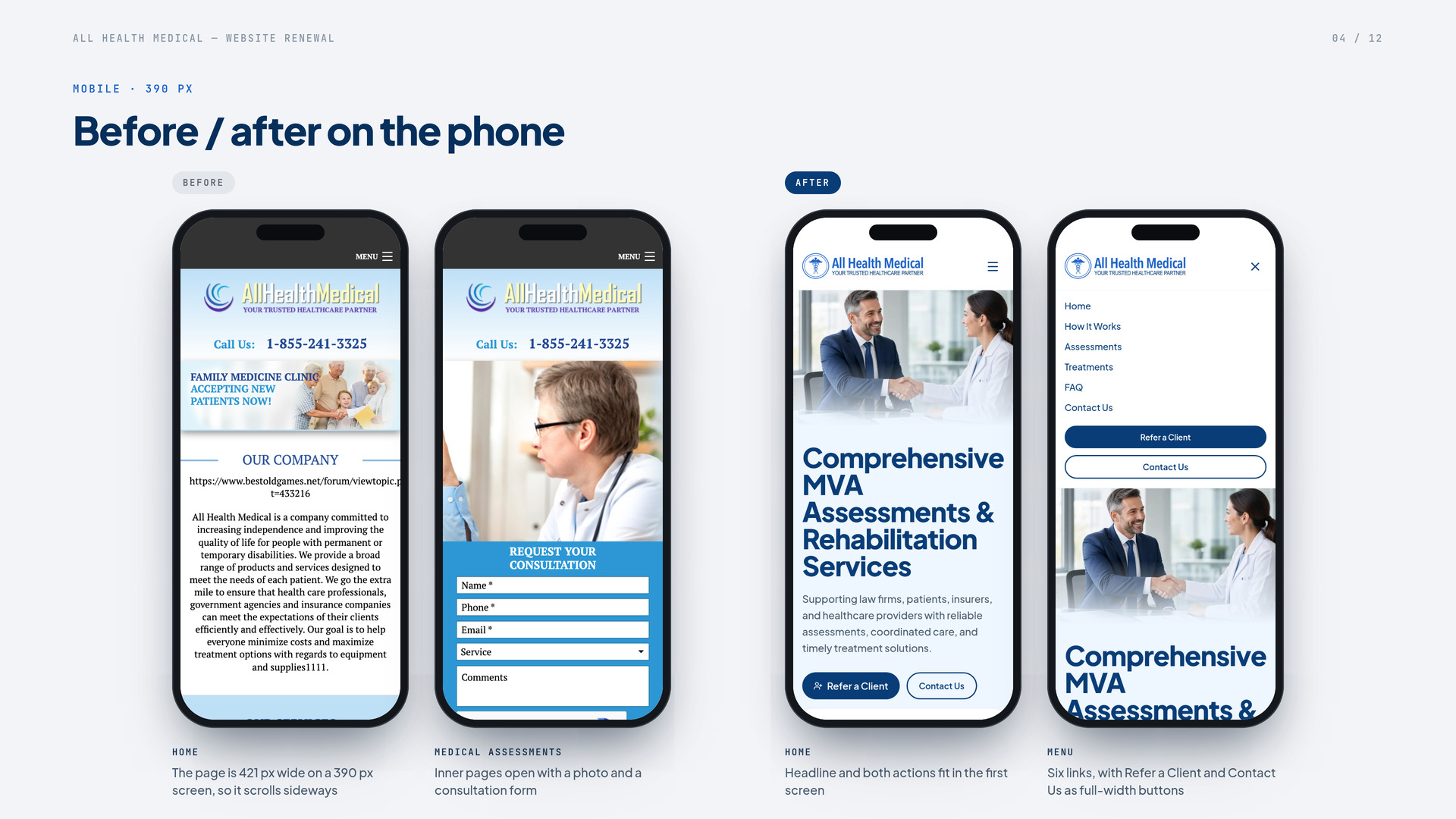
The homepage opened on a family medicine banner. The menu sprawled across rehab, family medicine, cardiac tests, funding and medical supplies. On a phone, the page ran off the screen, and the footer still said 2015.
The brief asked for modern, gentle and easy to read, including for older patients. We cut the menu to six links, grouped 41 assessments and 21 treatments into searchable lists, and put Refer a Client and Contact Us in every header.
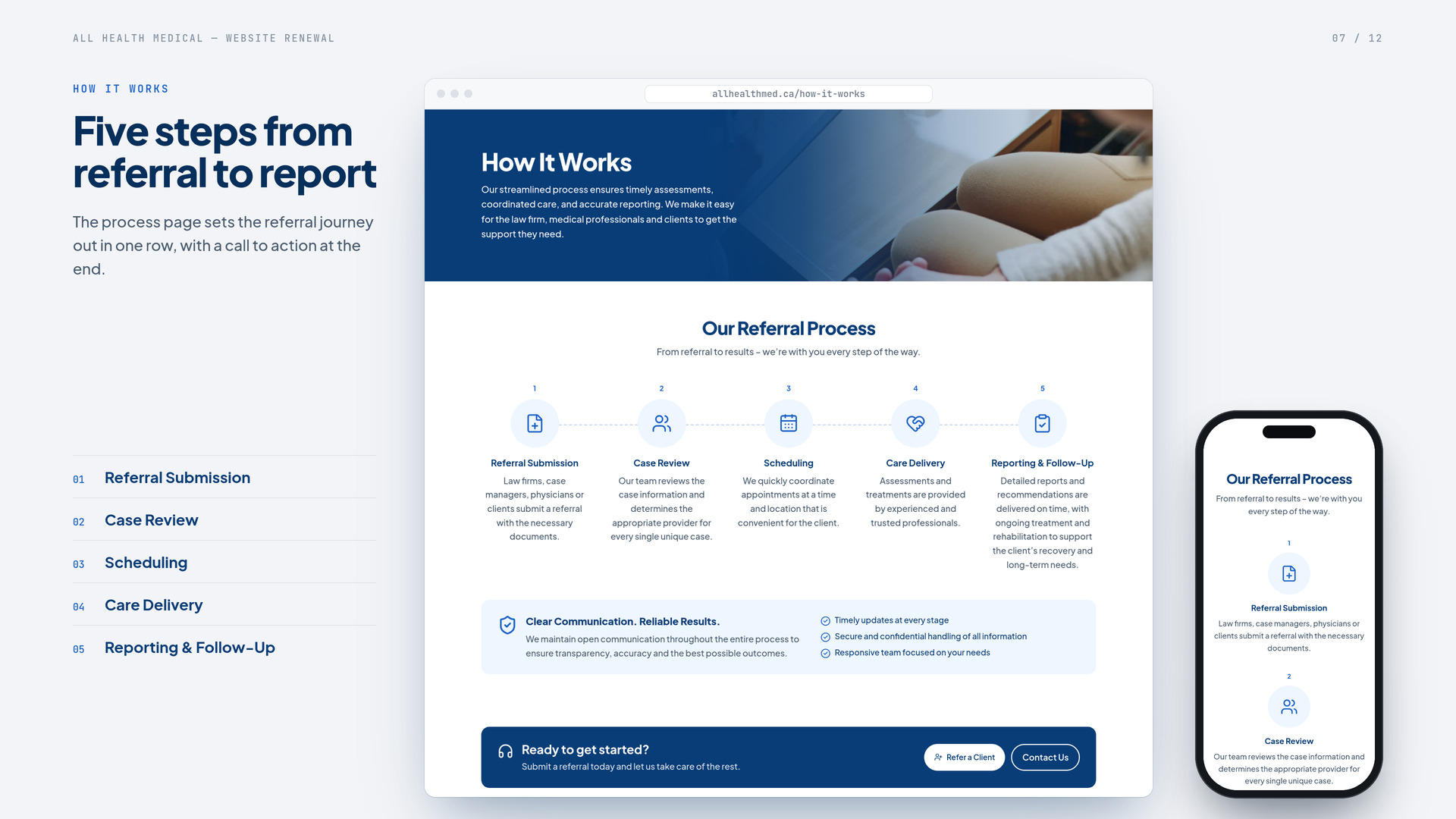
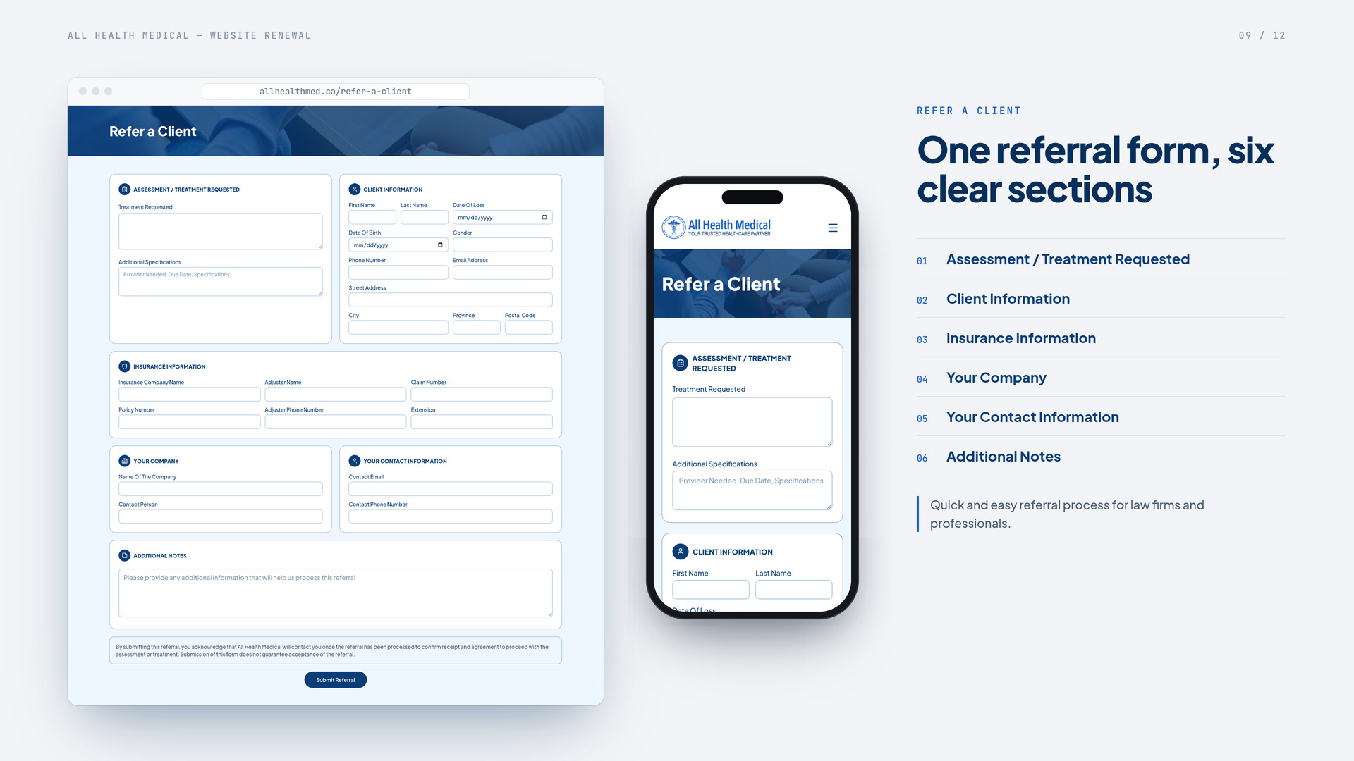
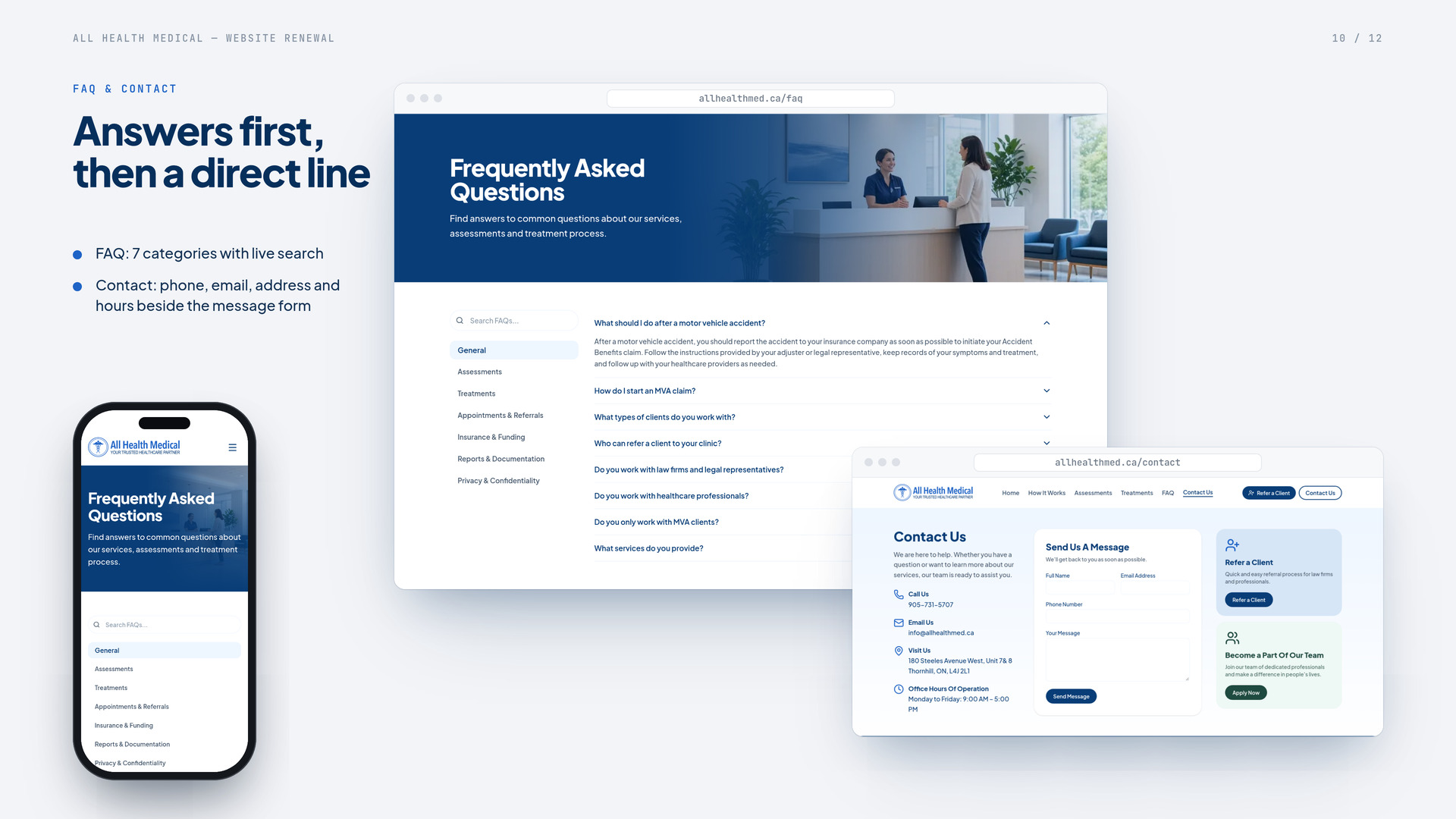
An eight-page site plus four legal pages. A five-step How It Works page, searchable assessments and treatments, an FAQ with 57 answers in 7 categories, and three forms for referrals, contact and careers.
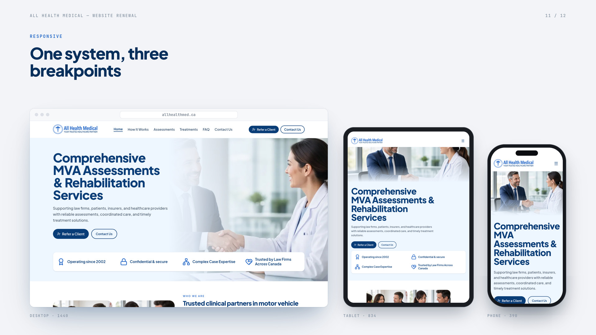
MVA assessments now lead the first screen, and Refer a Client is one tap from any page. The site fits every screen, with a skip link, clear focus states, larger base text and gentle motion that respects reduced-motion settings.
BeforeEight menu items with drop-downs covering rehab, family medicine, cardiac tests, funding and supplies.
AfterSix links, with Refer a Client and Contact Us as header buttons.
Before“Family Medicine Clinic Accepting New Patients Now!” and a phone number as the only action.
AfterA headline that names MVA assessments and rehabilitation, two clear buttons and a trust strip.
BeforeA separate page for every therapy, test and product.
AfterEight pages (Home, How It Works, Assessments, Treatments, FAQ, Contact Us, Refer a Client, Careers) plus four legal pages.
BeforeLong paragraphs spread across many pages.
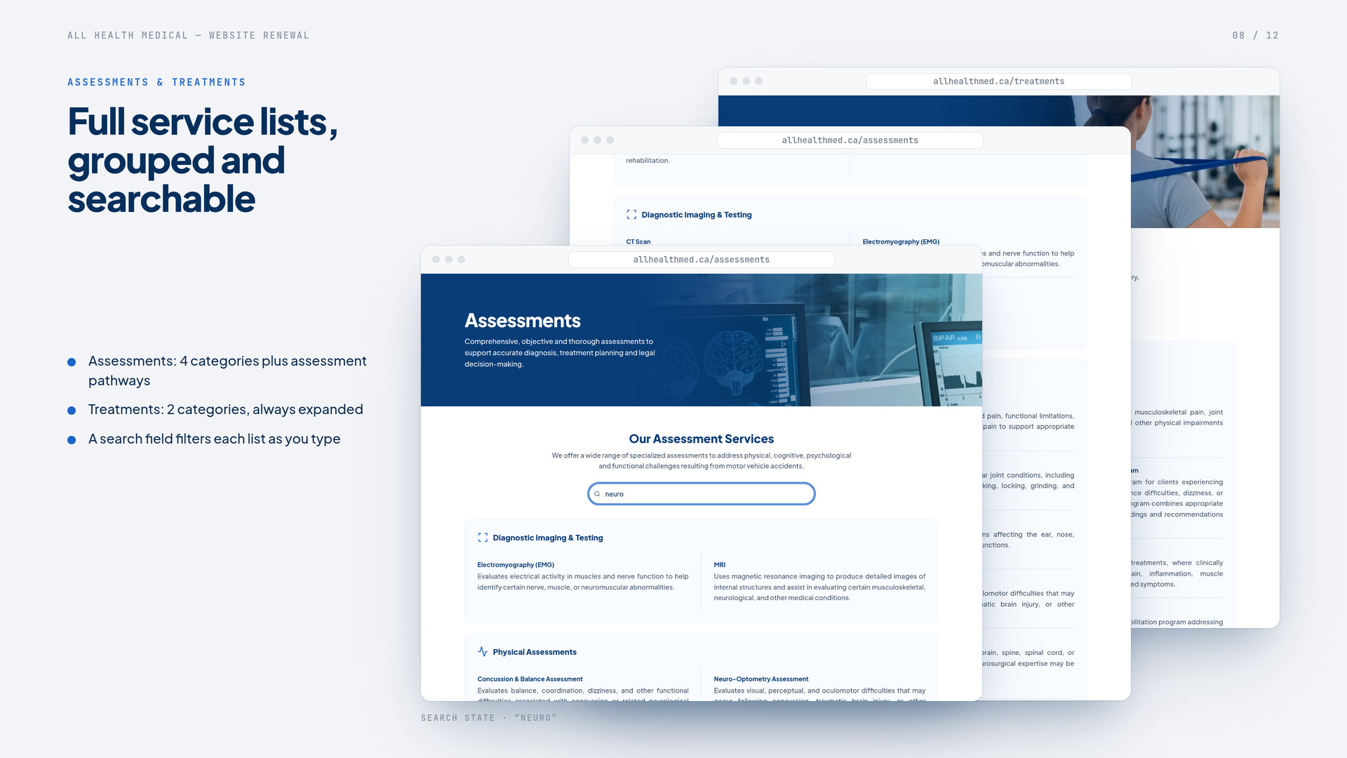
After41 assessments in 5 groups and 21 treatments in 2, each with a short description and a search that filters as you type.
BeforeRefer a Patient sat under Family Medicine, behind a consultation form with a promotions opt-in.
AfterOne Refer a Client form in six sections, sent straight to a referrals inbox.
BeforeAt phone width, the logo and text were cut off at the right edge.
AfterLayouts for phone, tablet and desktop, with full-width buttons in the mobile menu.
BeforeStray link text, a typo in the intro and a © 2015 footer.
AfterCurrent service copy, 57 FAQ answers, and up-to-date contact details and hours.
BeforeSerif display type over gradient photo banners.
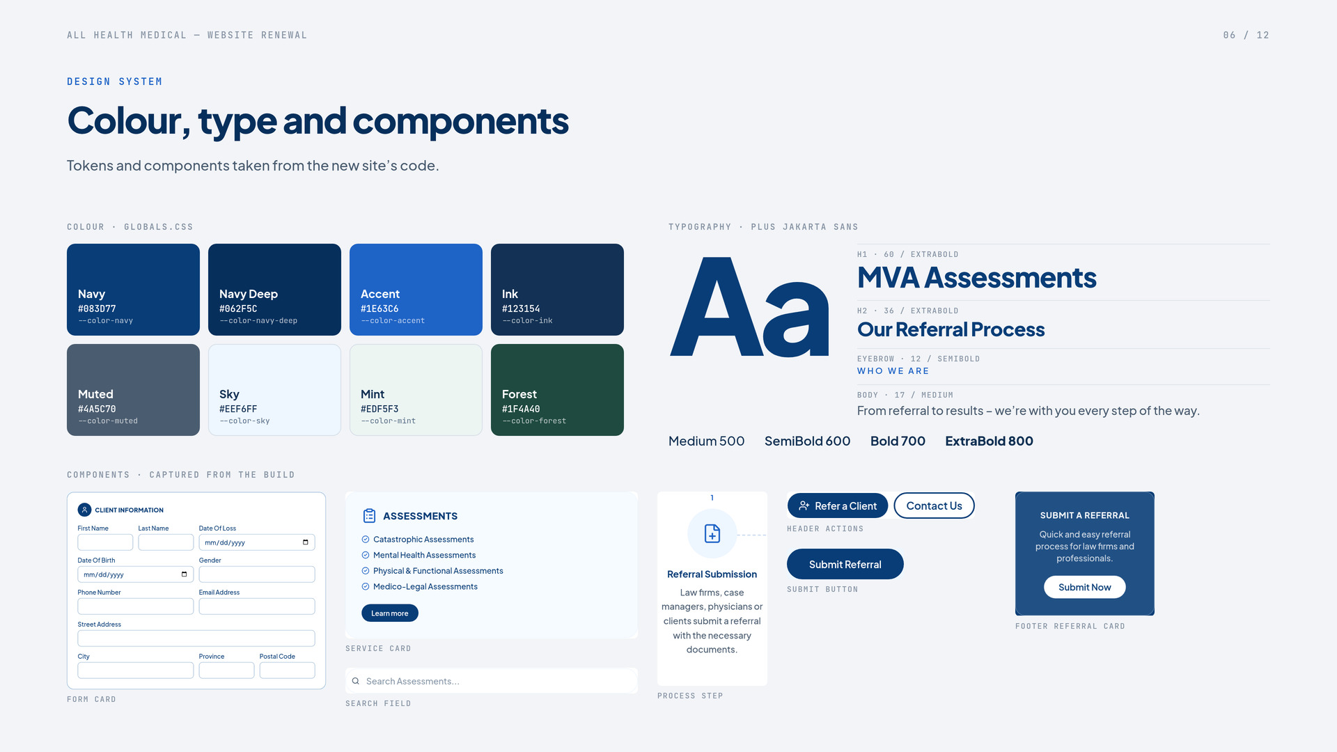
AfterOne type family and a calm navy, sky and mint palette built around the clinic’s new logo.
BeforeThe homepage’s only main heading was an empty logo link.
AfterA skip link, visible focus states, labelled search fields, reduced-motion support, 17 px base text and an Accessibility page.
BeforeA single Privacy Policy link.
AfterPrivacy, Confidentiality, Terms of Use and Accessibility pages.
You are absolutely amazing, and we really appreciate everything you’re doing with the website!
All Health Medical client