Victura is a real estate investment firm. We designed its identity, then rebuilt its investor deck in that identity, slide by slide.
- Logo design
- Colour and type
- Slide-by-slide audit
- Brand template

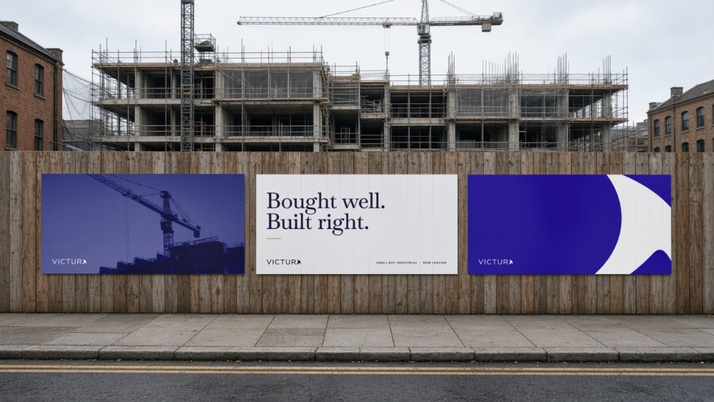
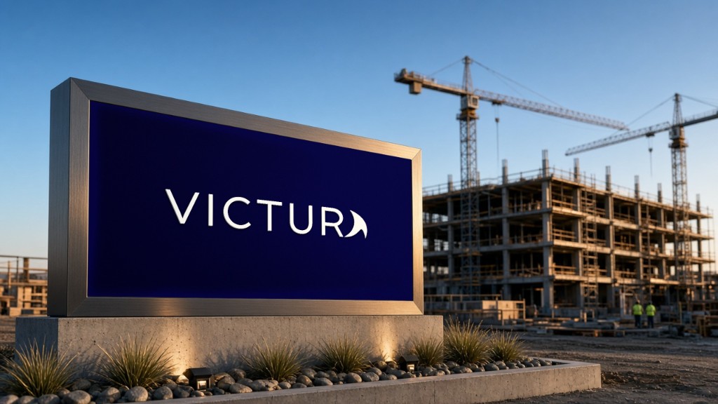
Victura is a real estate investment firm. We designed its identity, then rebuilt its investor deck in that identity, slide by slide.
Victura needed an identity and a deck to raise with. The previous deck had strong content on dated slides: dense text, flat type, no display font, nothing in Victura’s brand.
We started with the brand: a wordmark with a swept final A, light and dark versions, and a palette of midnight blue, deep sea and red orange. Then we logged eight deck problems and fixed each in that system.
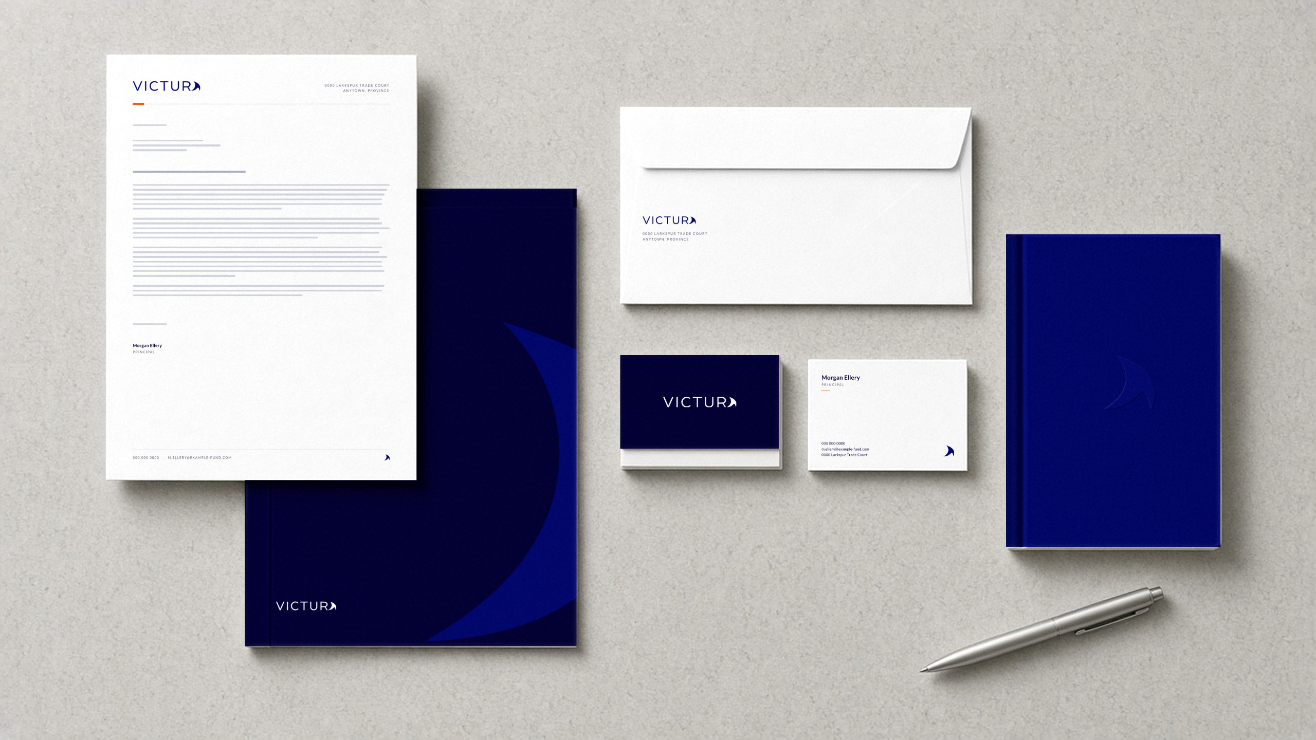
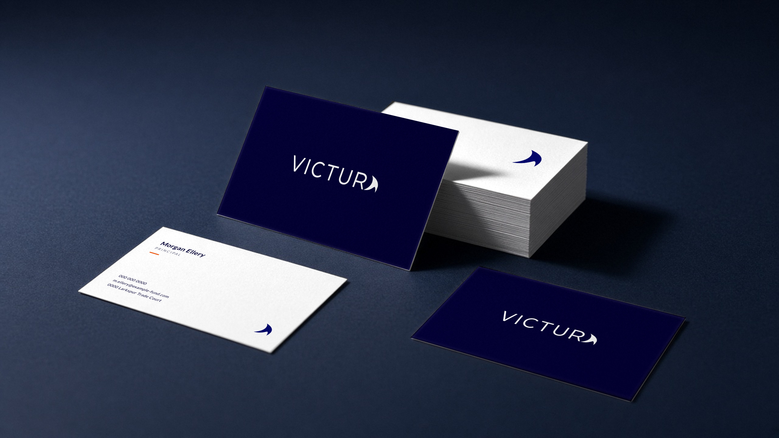
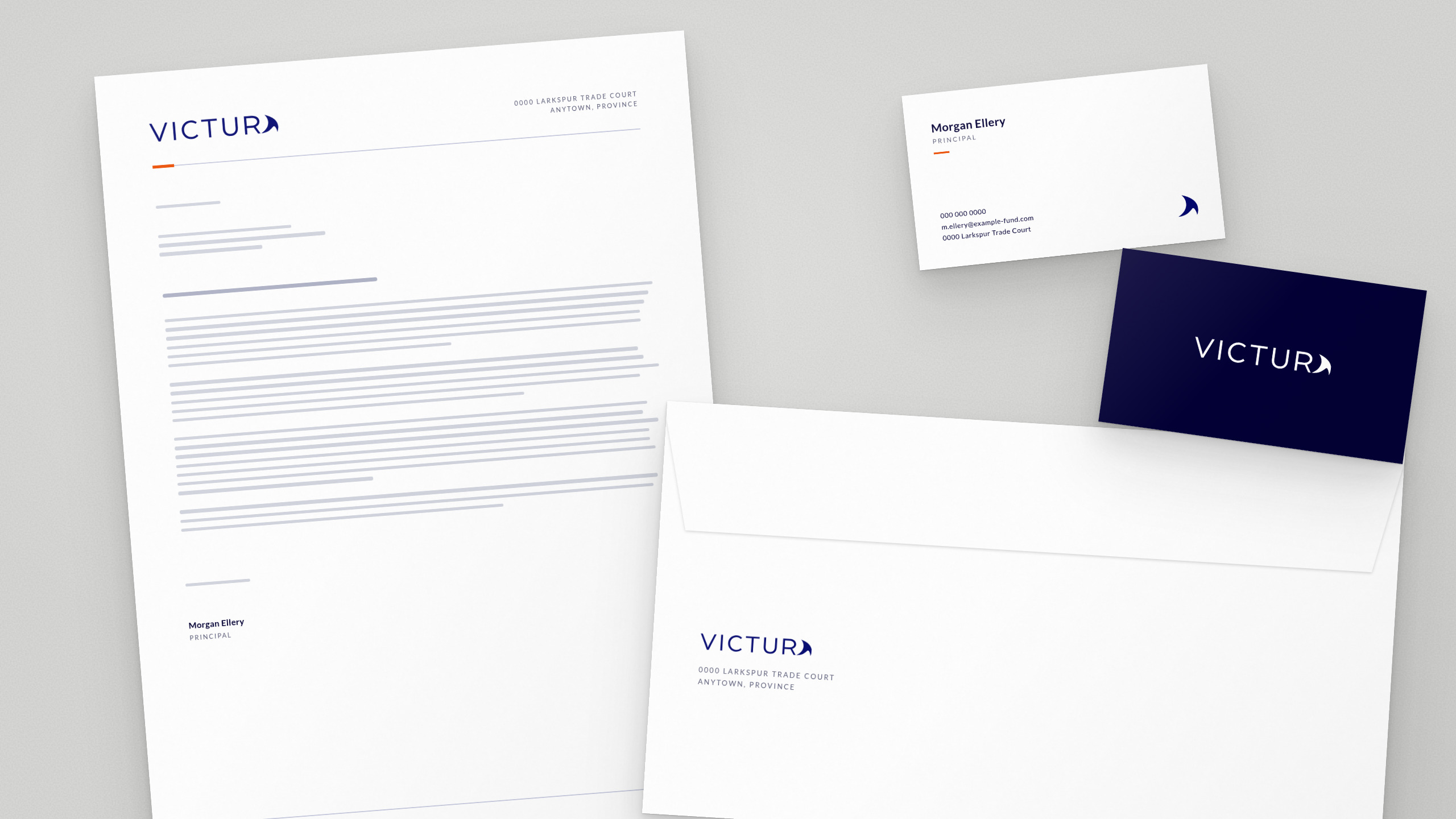

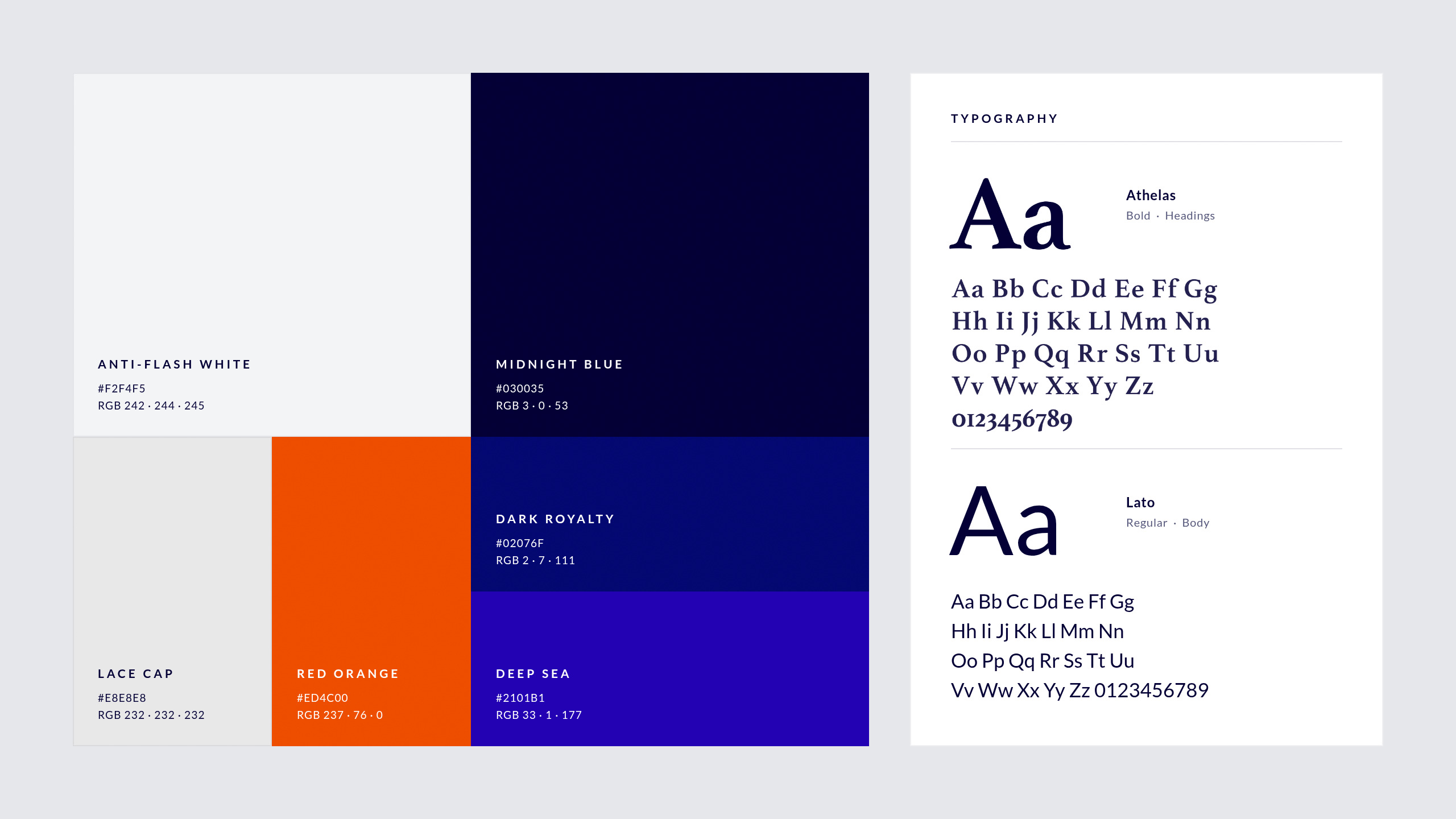


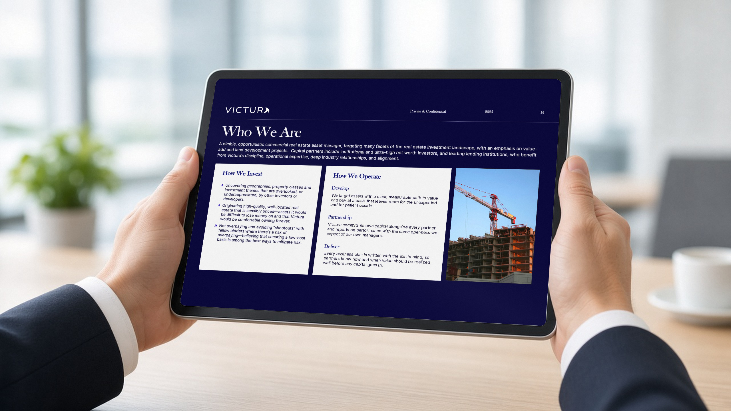
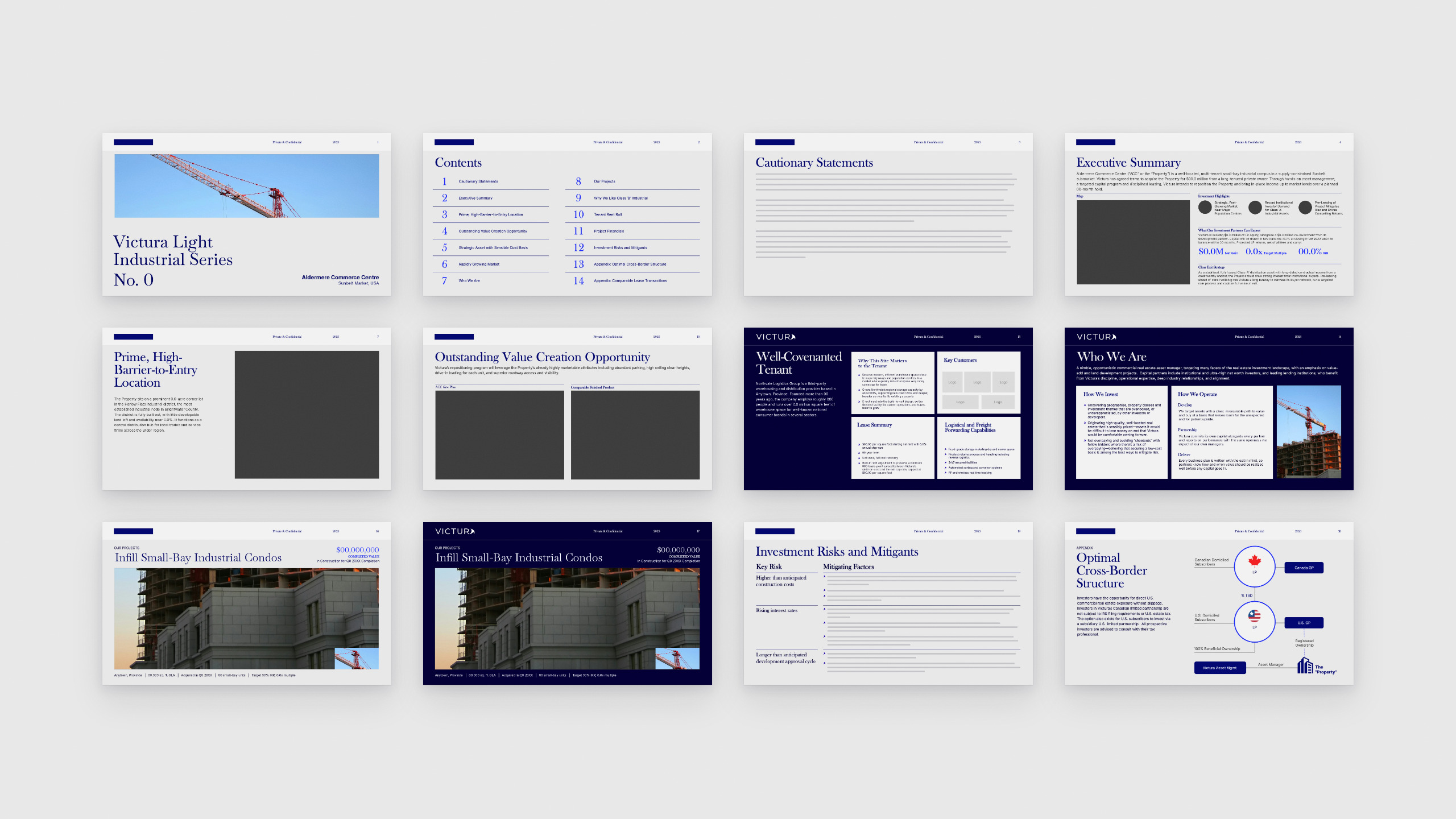
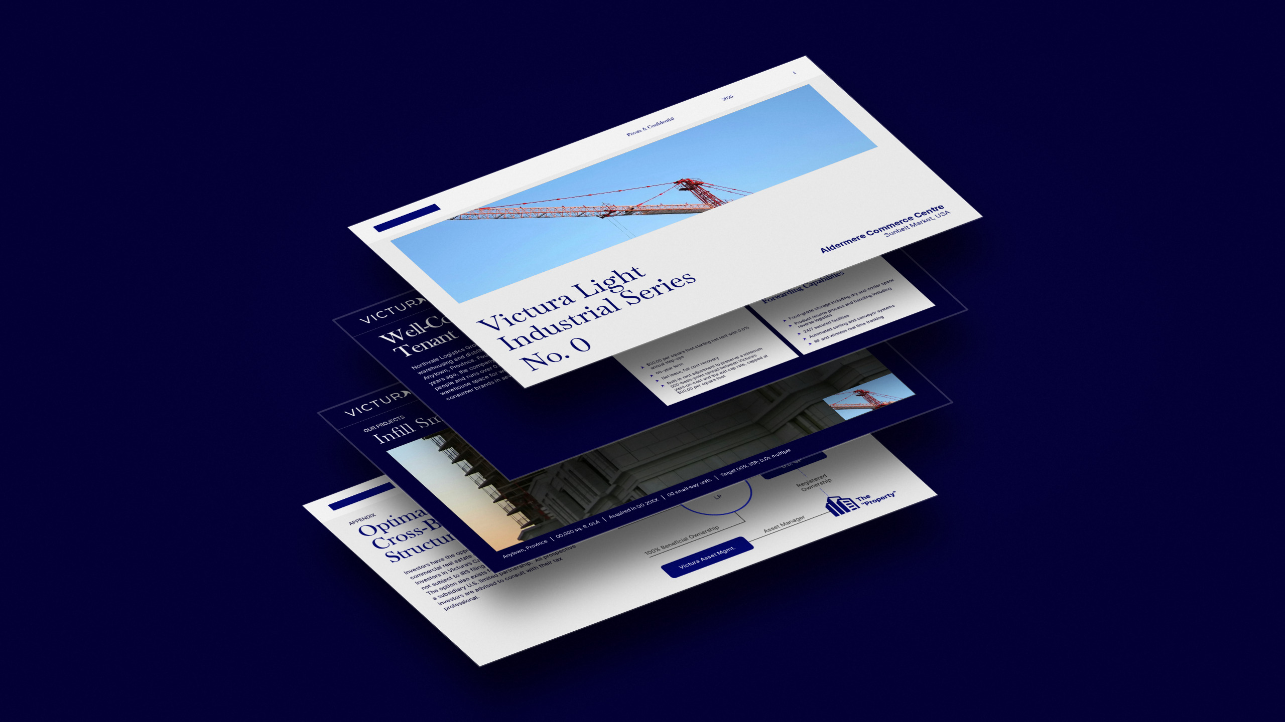
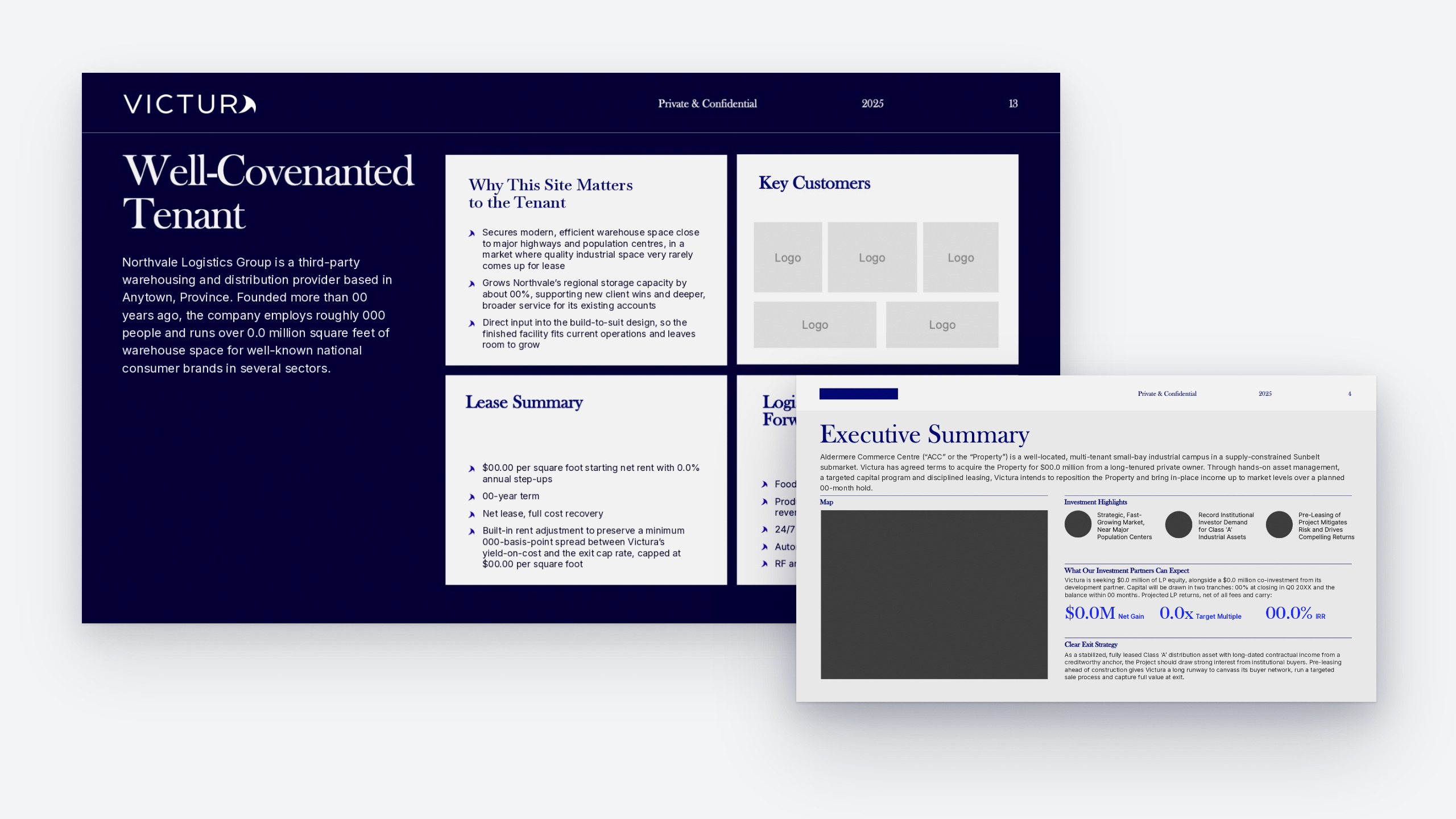
A wordmark in light and dark versions, a six-colour palette, and Athelas and Lato. A deck template with a header bar, fixed margins, serif display type and large return callouts.
The brand and the deck now read as one firm. The client presented the deck and closed a 5-acre commercial building deal.
This deck clearly stands out, and the flow was great when we presented it.
Victura client