Champagne Madame Zéro pairs old-world craft with low sugar and full transparency. We refreshed the brand so it carries tradition and modernity at once.
- Colour system
- Typography
- Brand elements
- Art direction
Champagne Madame Zéro pairs old-world craft with low sugar and full transparency. We refreshed the brand so it carries tradition and modernity at once.
The palette was almost all dark, so elements blended together. Backgrounds leaned on video overlays with no structure. Type was set in Futura. The brand needed contrast and rules.
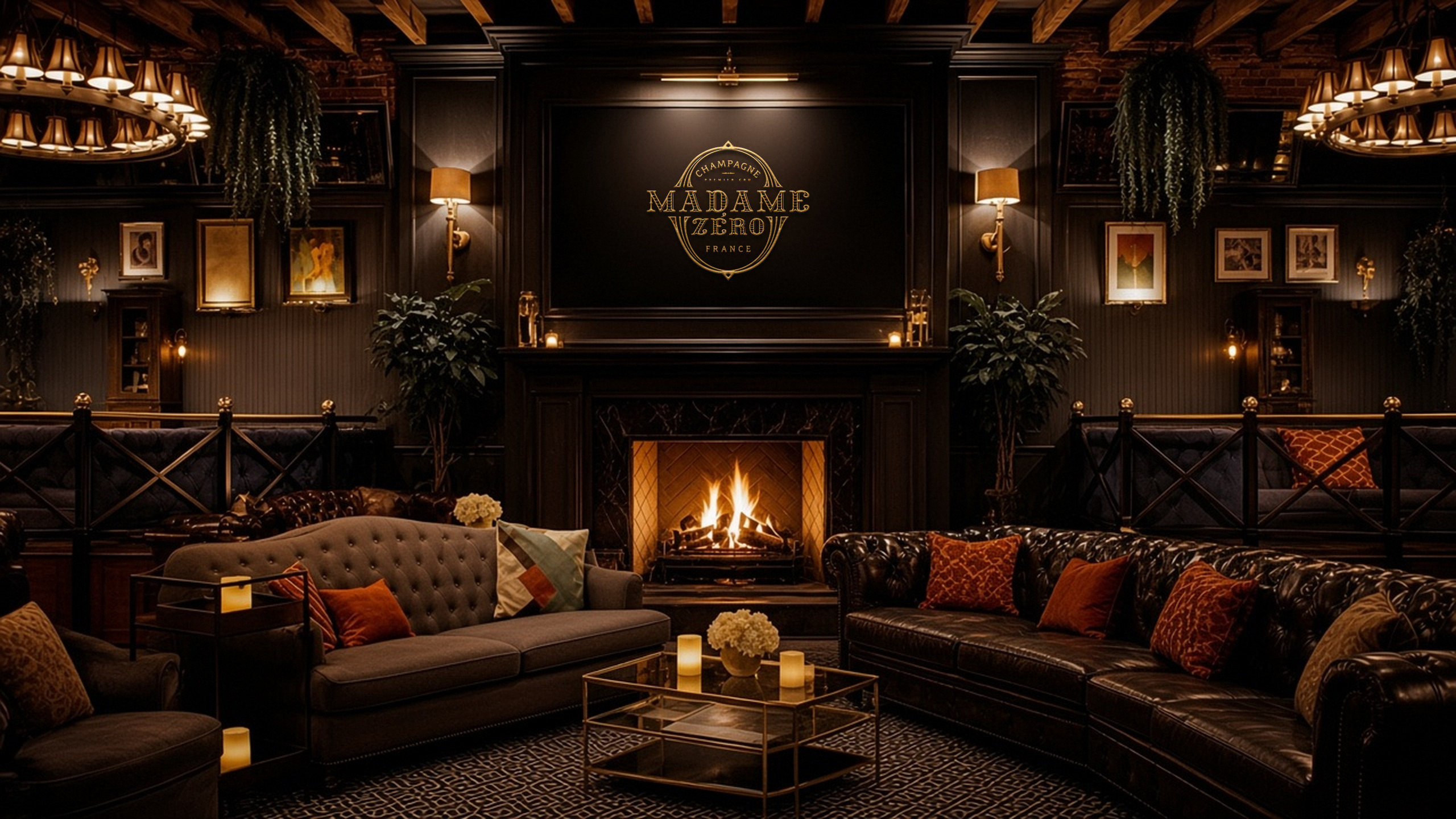
We kept what people already know: the crest, the name, black and gold. Around it we set a colour ratio with warm neutrals and accents, a new type pairing, and a mood that mixes 19th-century elegance with modern collage.
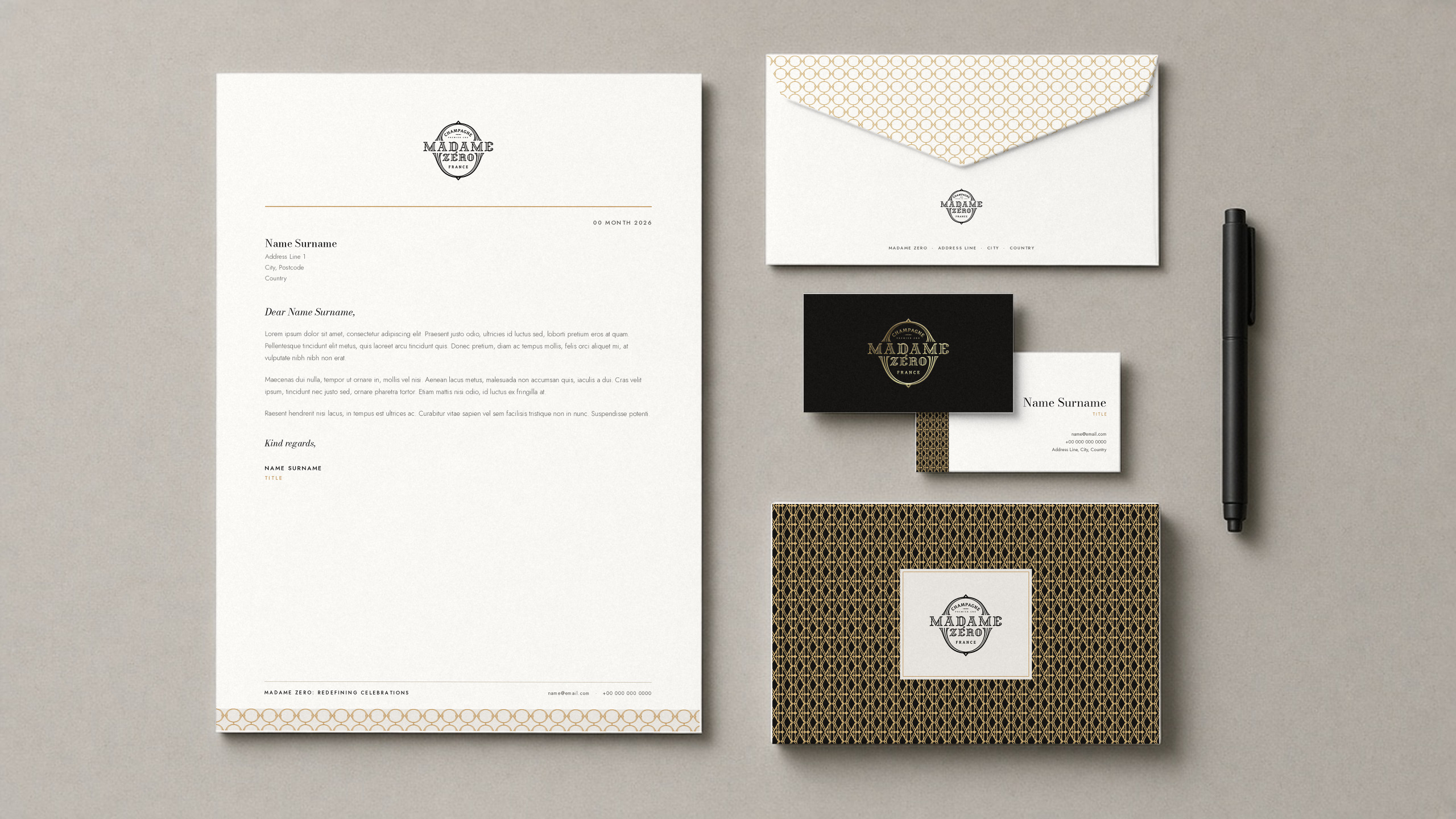
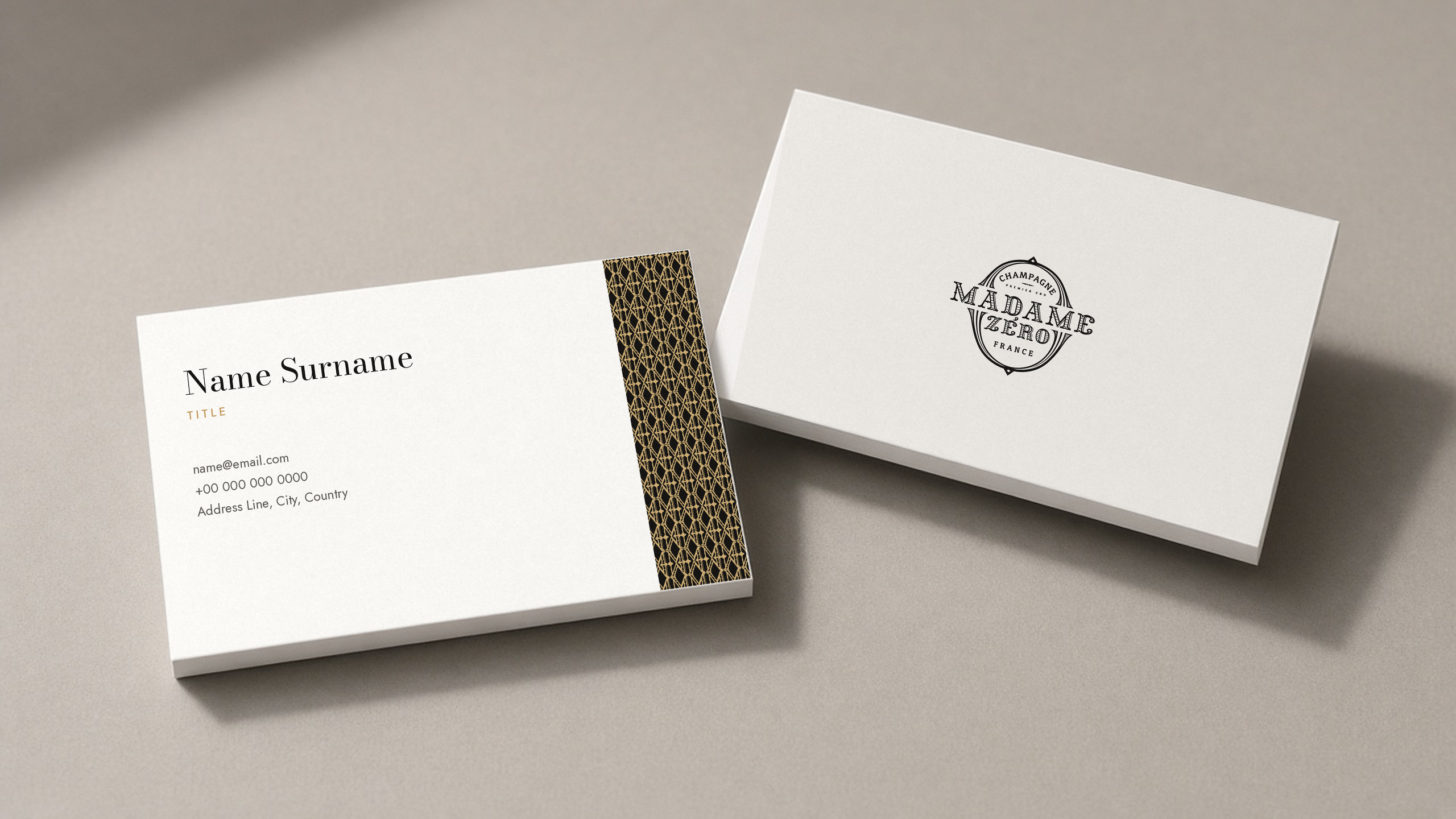
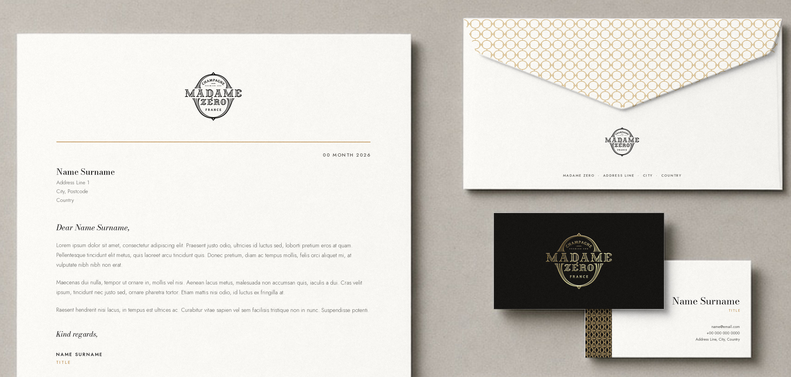
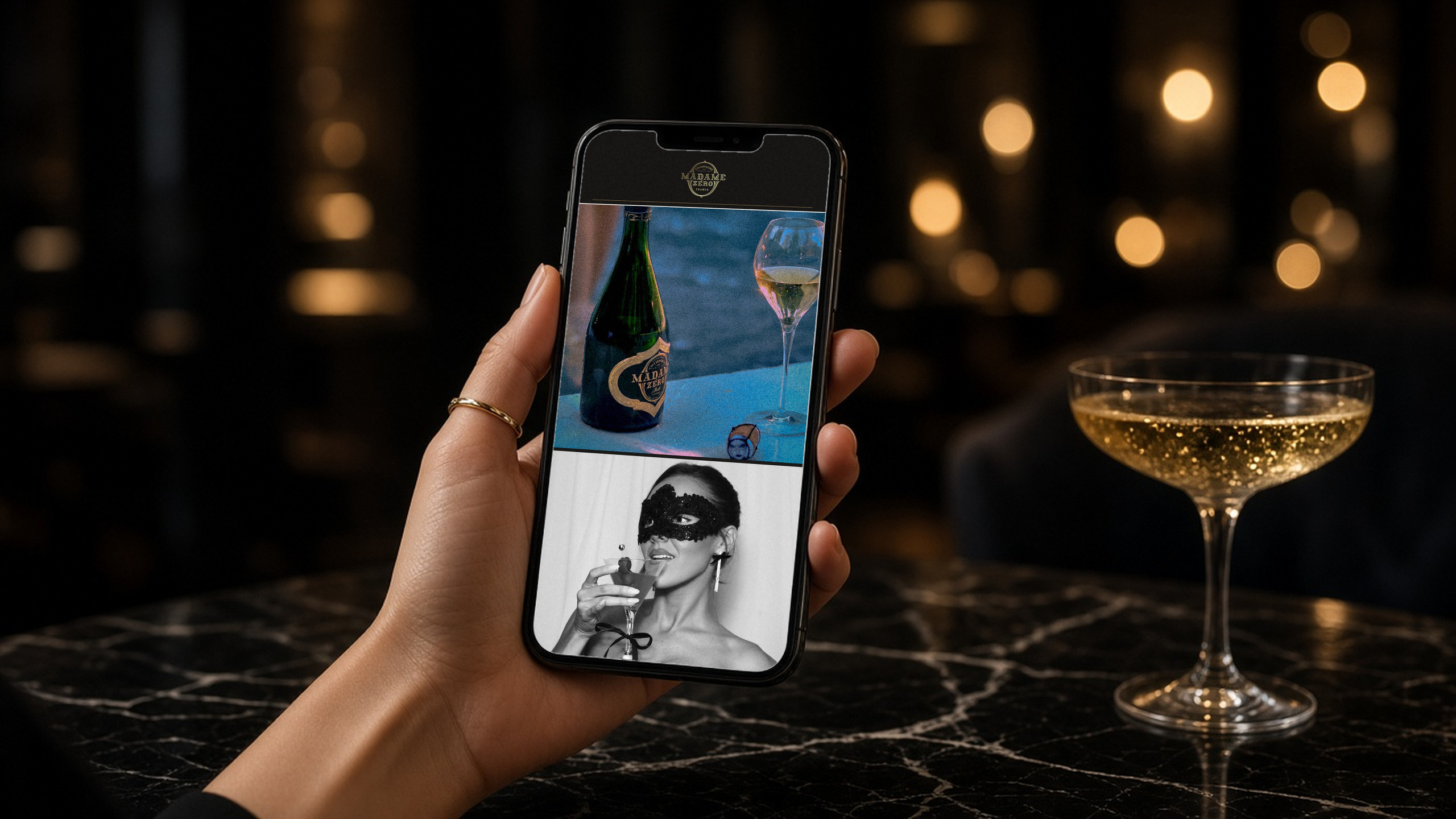
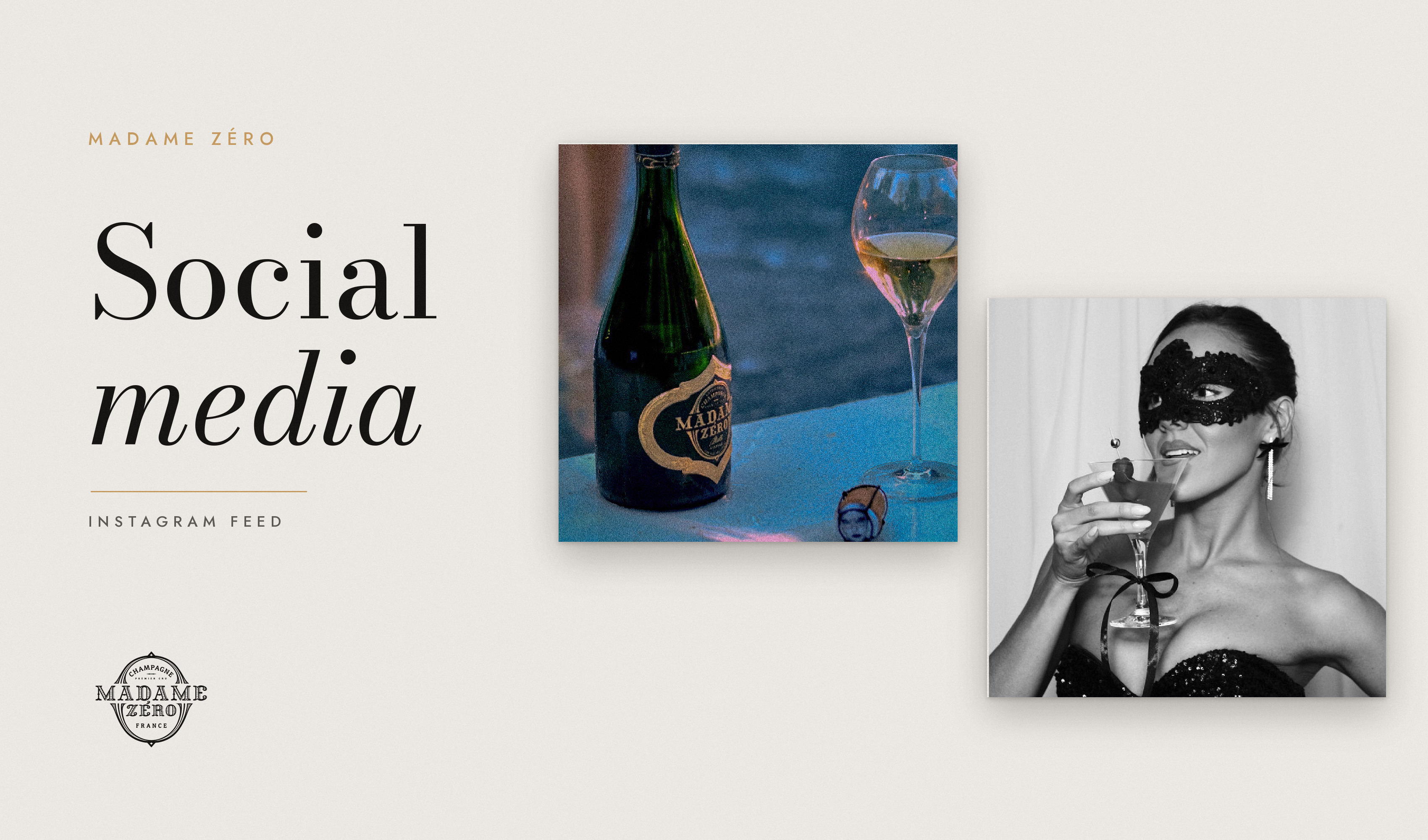
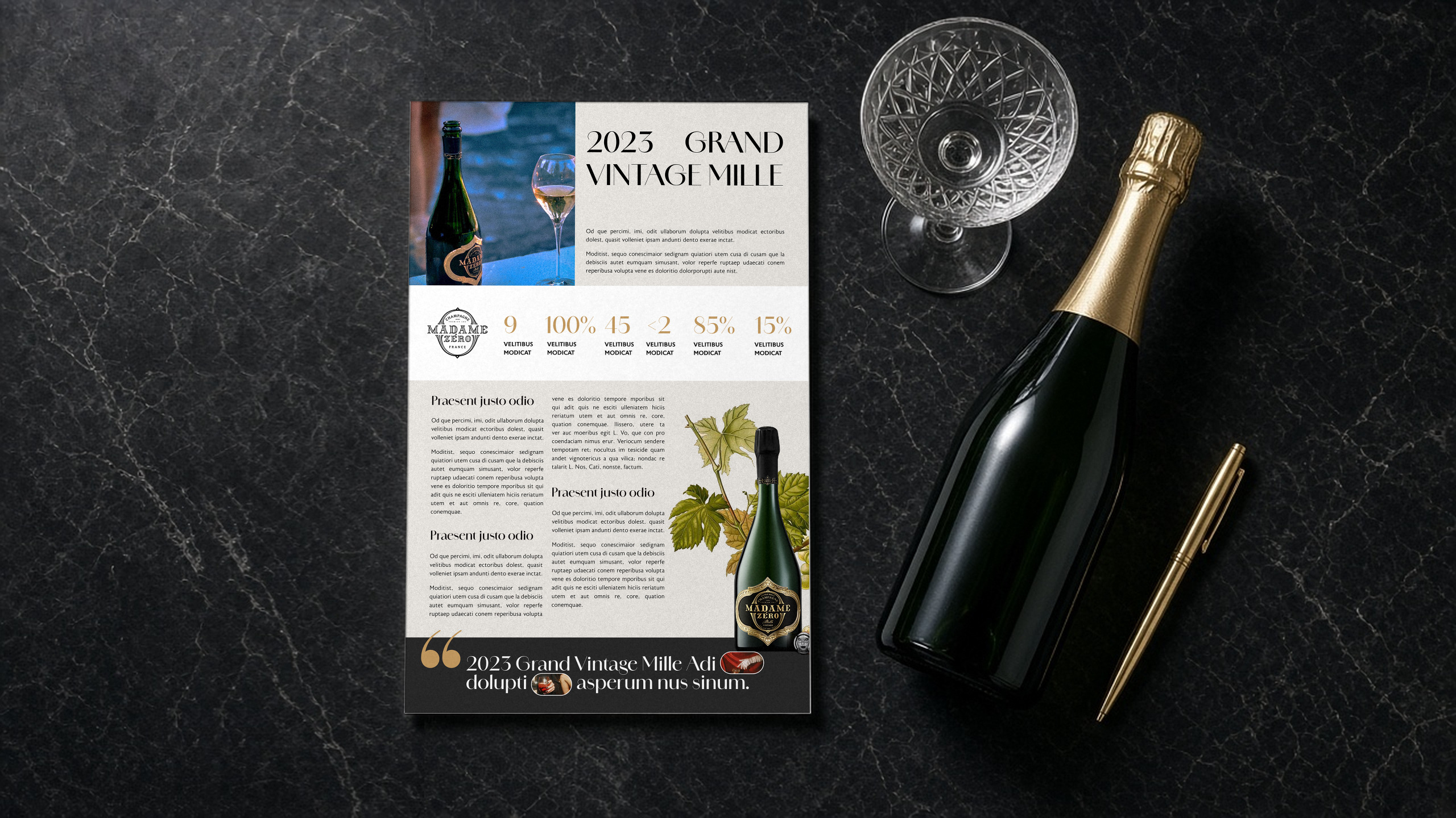
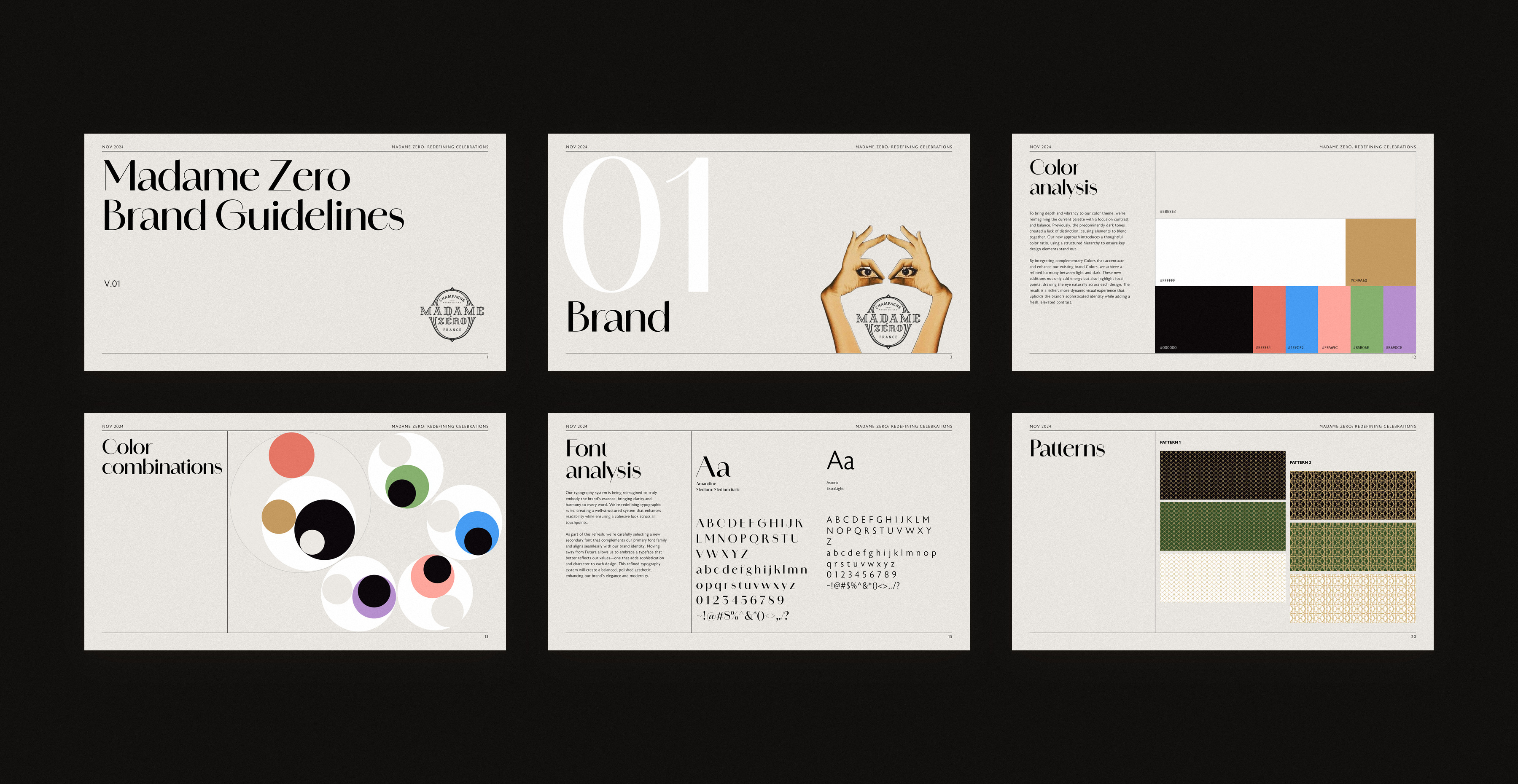
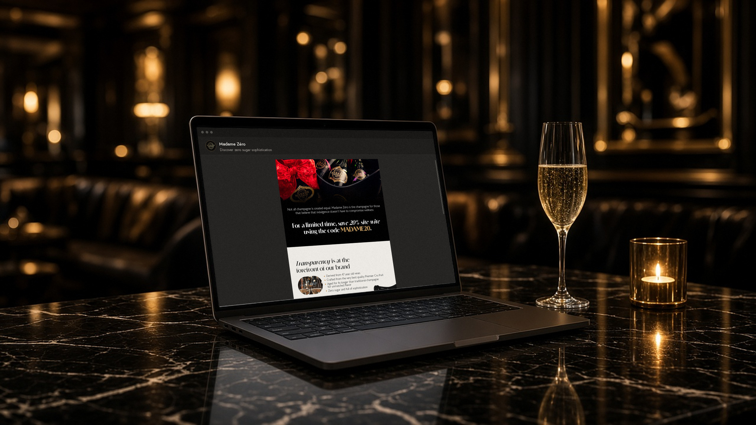
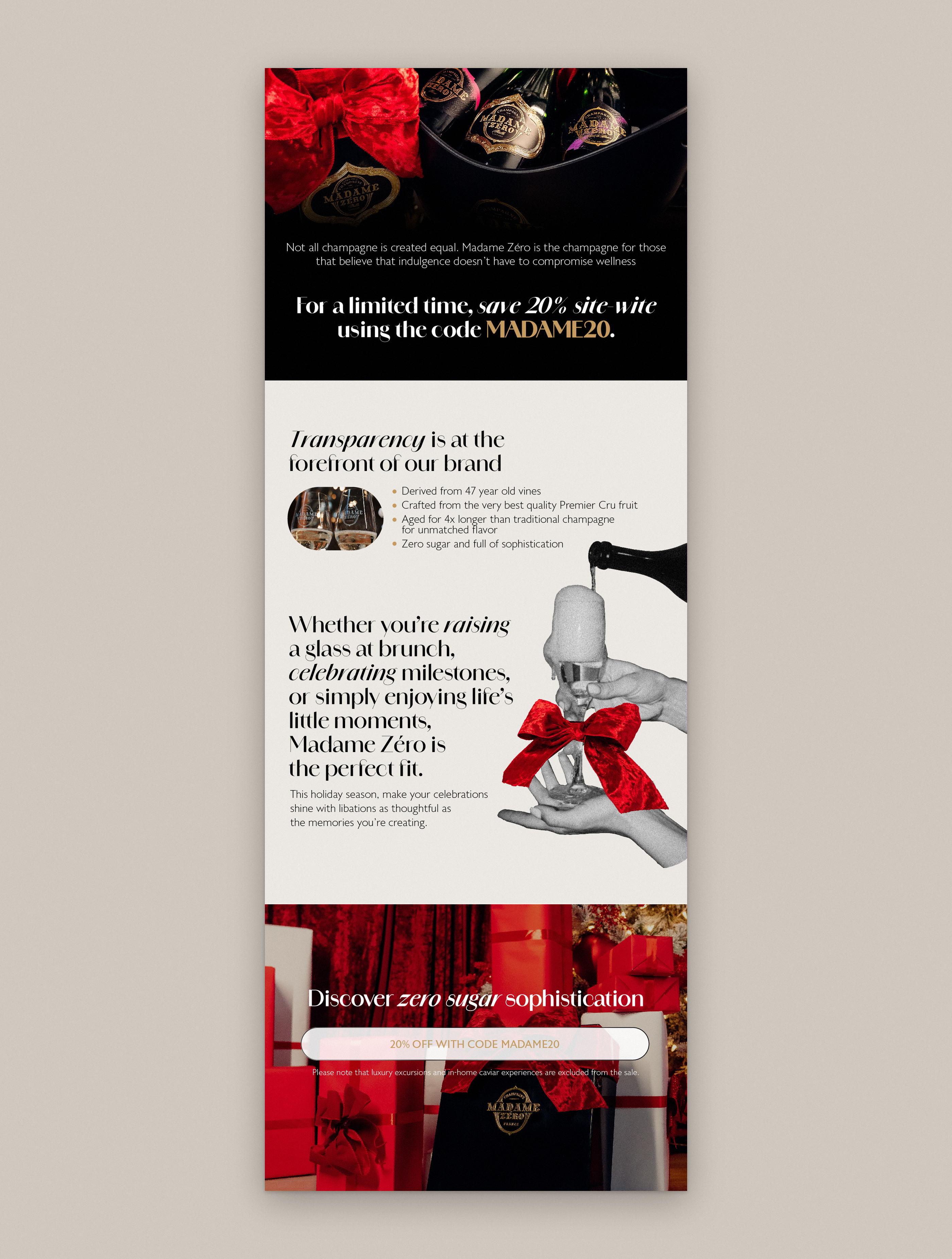
Refreshed guidelines for colour, type, patterns, texture, collage and imagery. A social grid template, email templates, and concepts for a landing page and product sheet.
The house still looks like itself. Now it has contrast, a clear hierarchy and rules every team can follow.