Saltair Nordic is a spa and wellness destination on Nova Scotia’s North Mountain, above the Bay of Fundy. We refreshed its brand to feel as calm as the place.
- Logo concepts
- Logo system
- Colour palette
- Brand guidelines
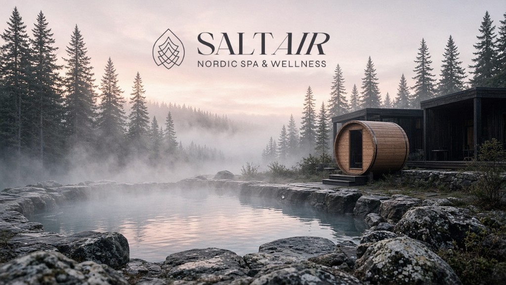
Saltair Nordic is a spa and wellness destination on Nova Scotia’s North Mountain, above the Bay of Fundy. We refreshed its brand to feel as calm as the place.
Saltair already had a logo. The refresh had to keep the brand recognizable and add a new perspective. The new look had to read as calm, modern and premium, on paper and on screen.
We explored three concepts. The lead one combines fire, water and northern white cedar into one mark that reads as wave and wind. The mark and the wordmark work together or apart.
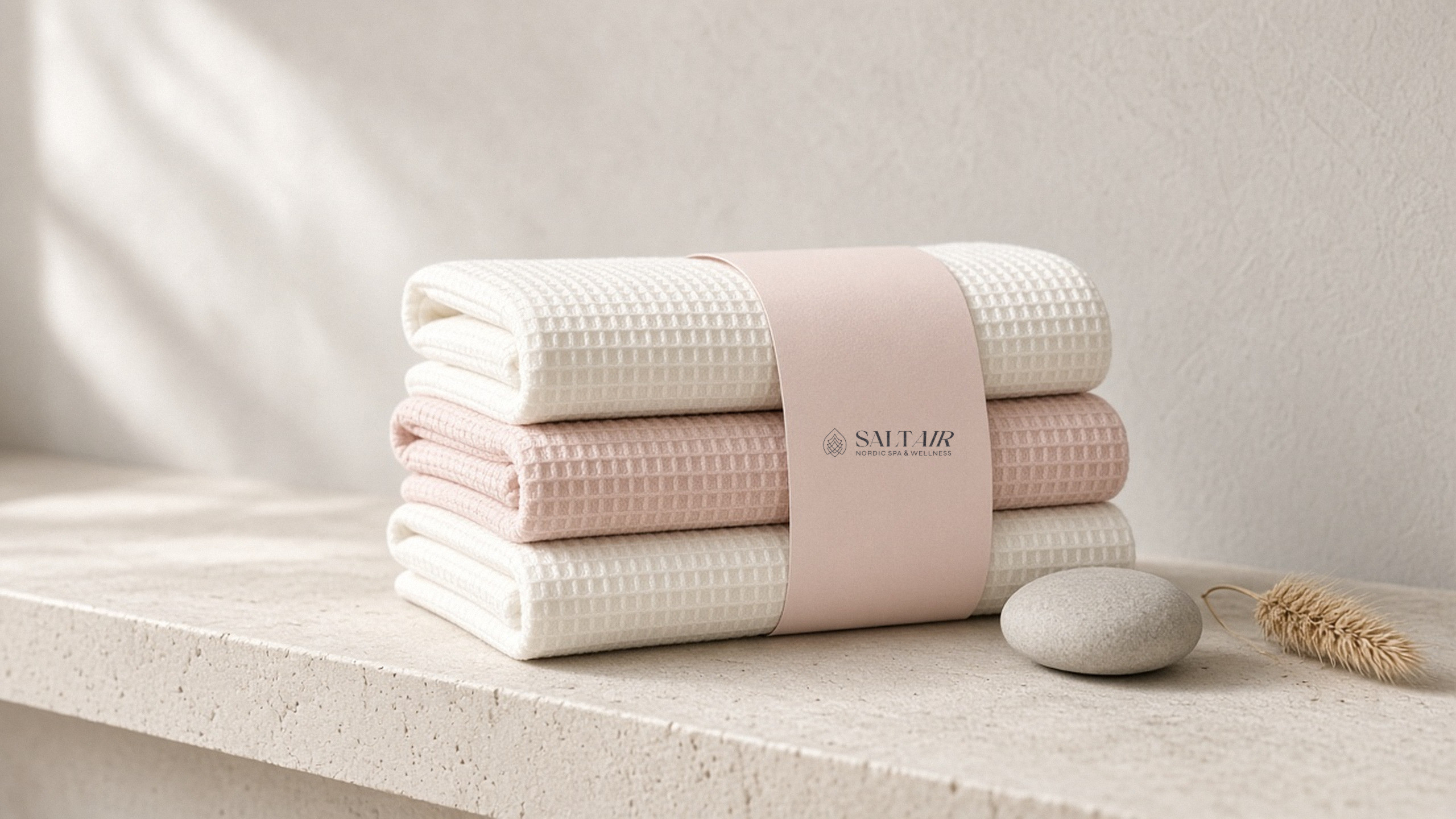
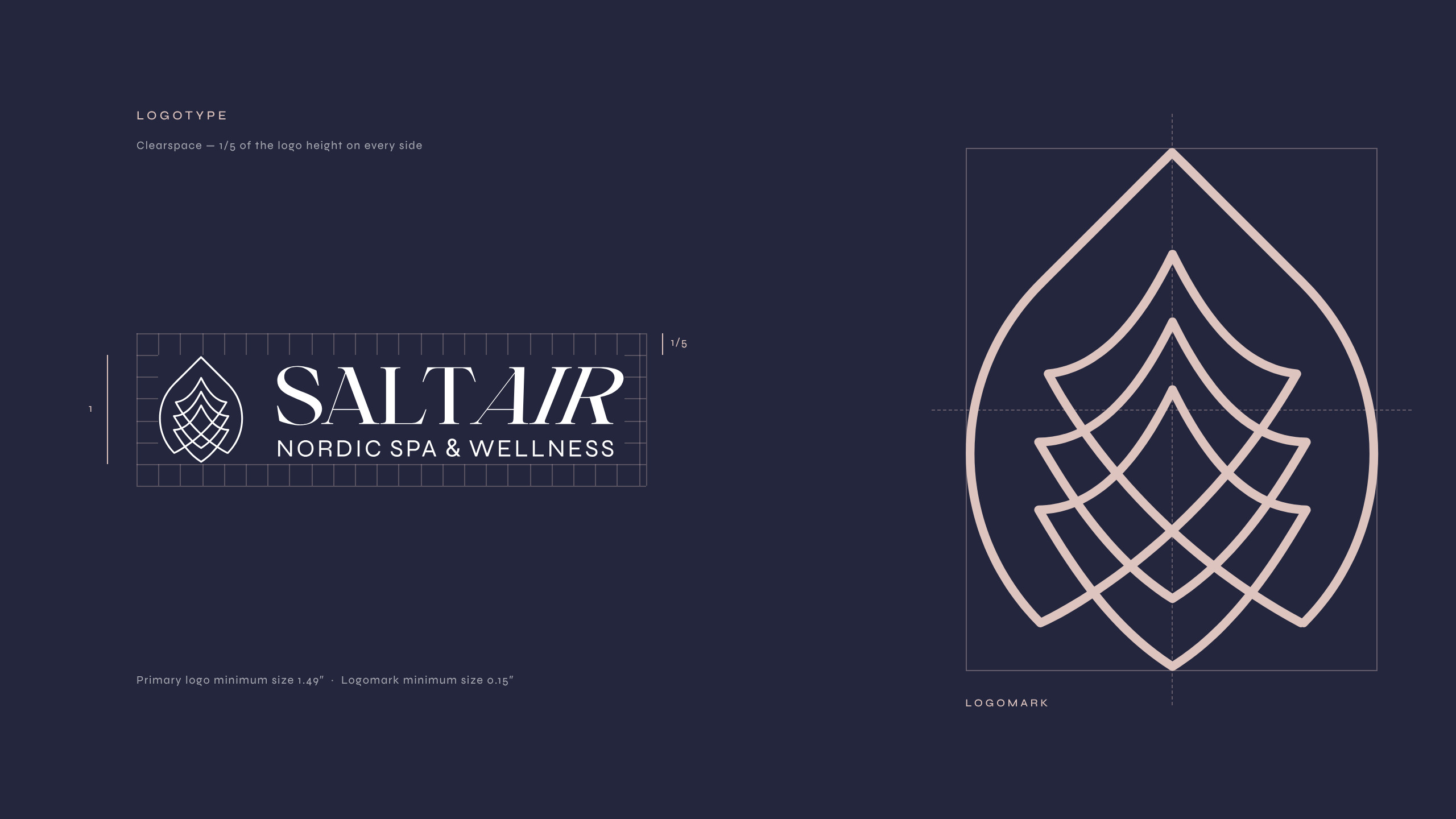
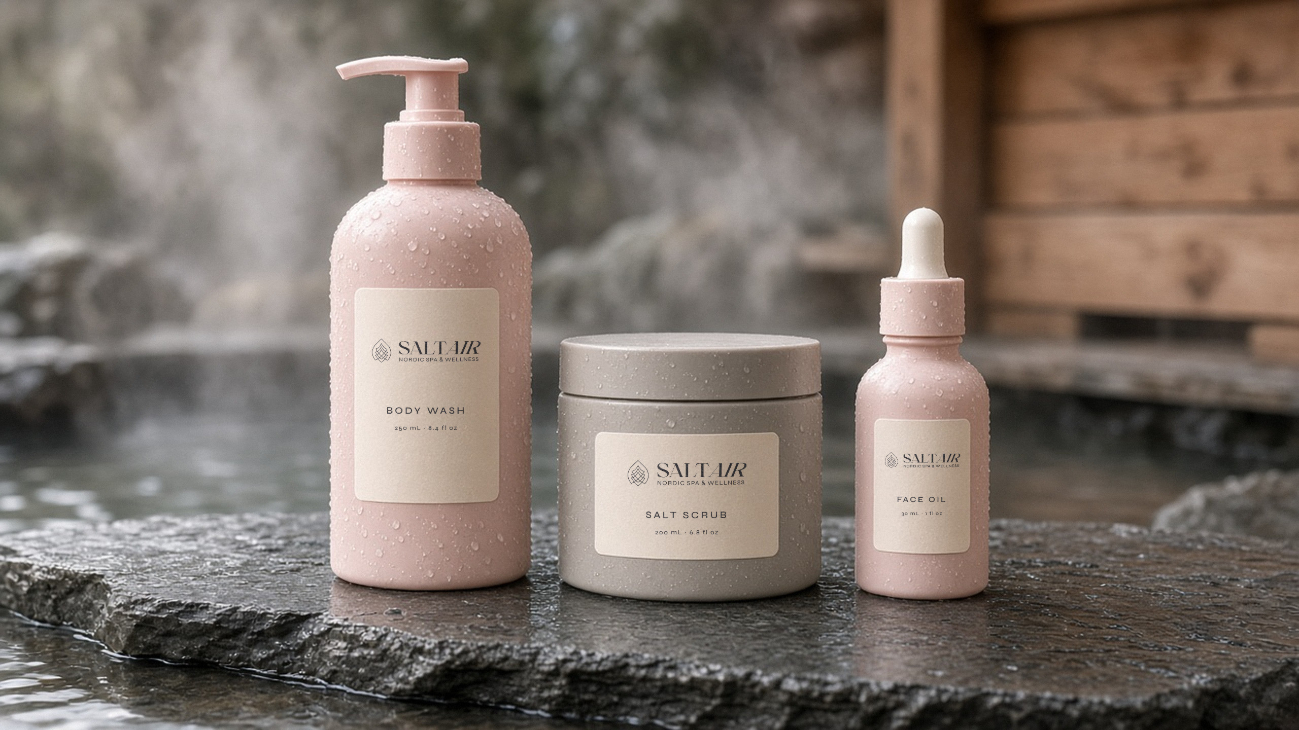
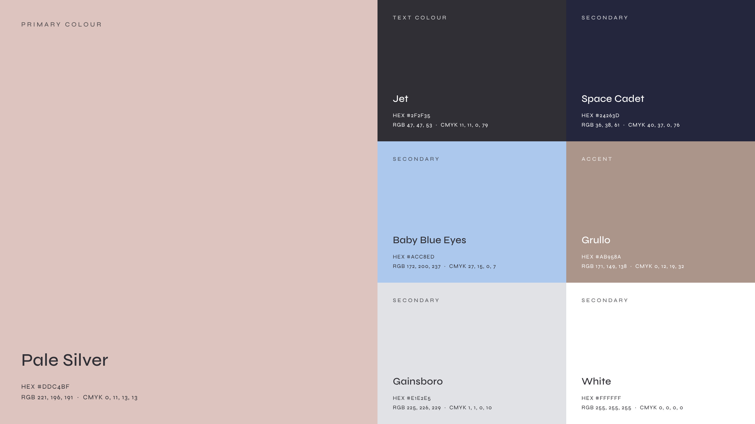
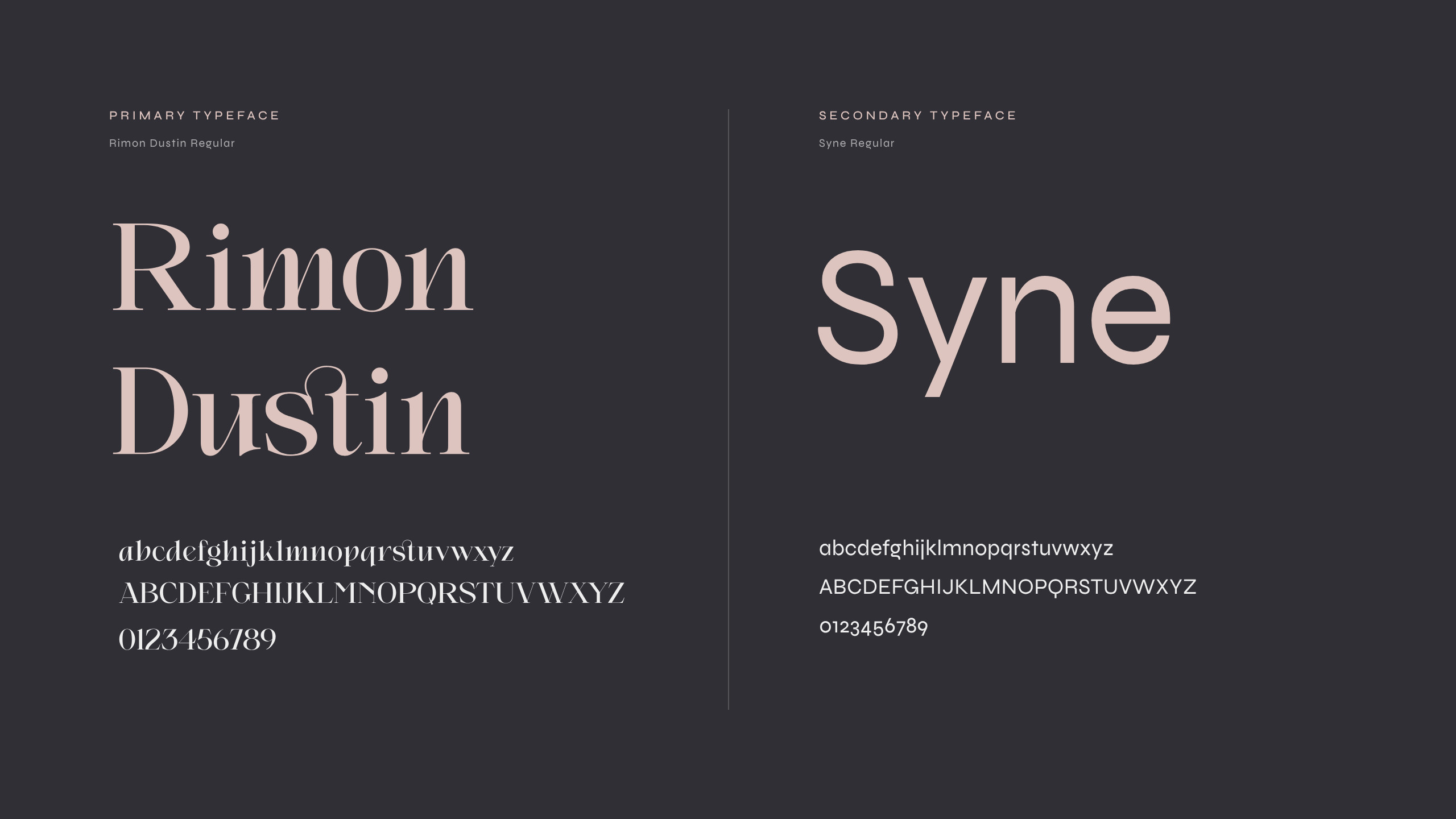
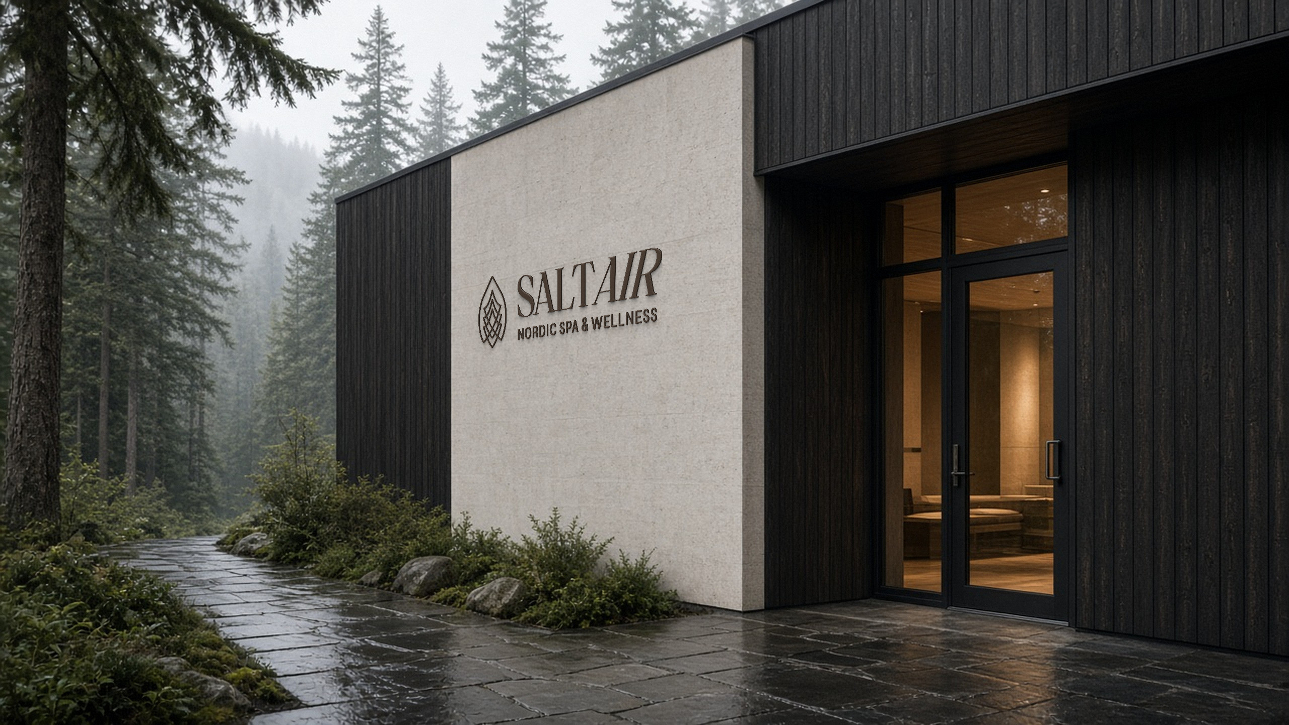
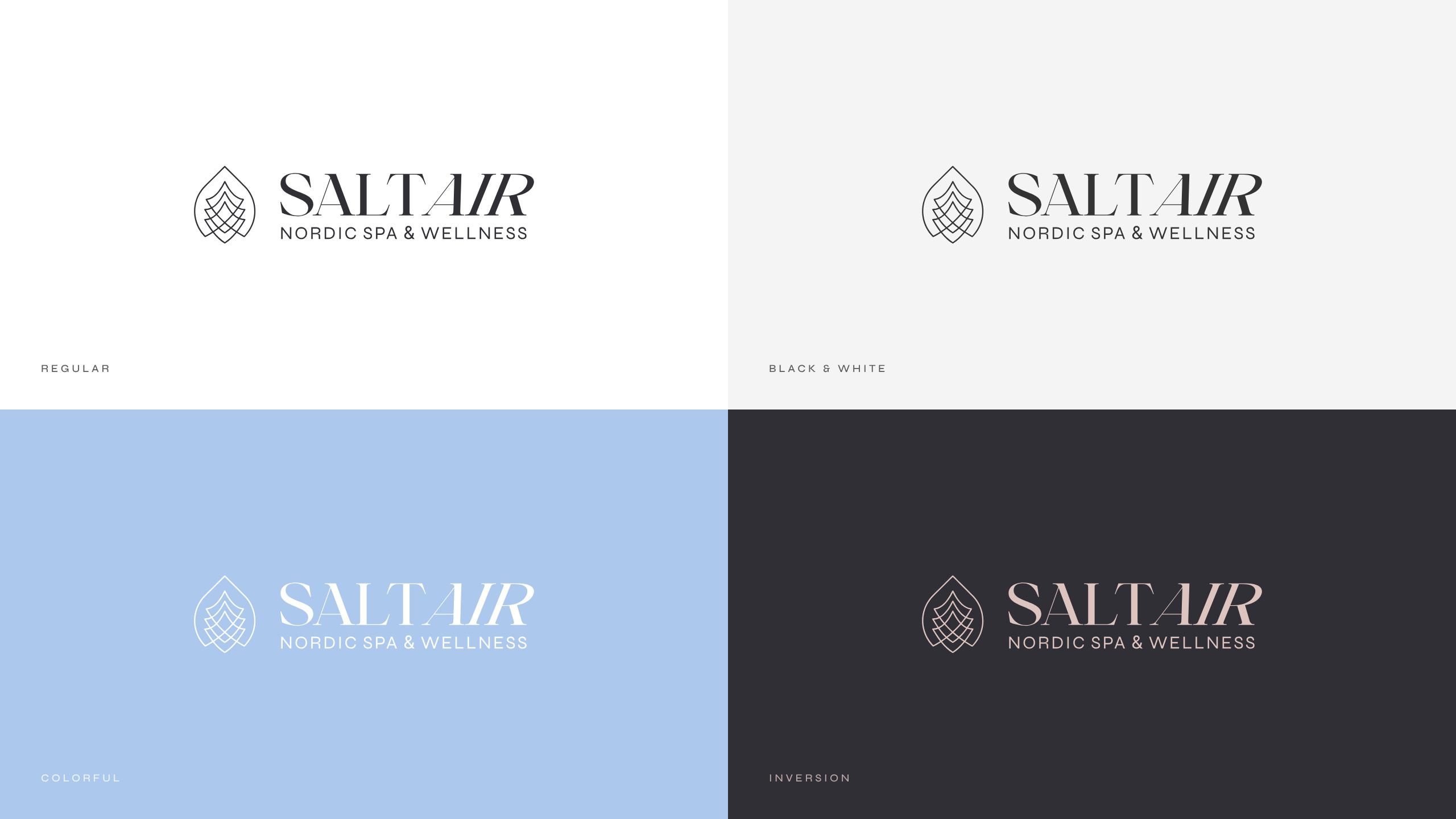
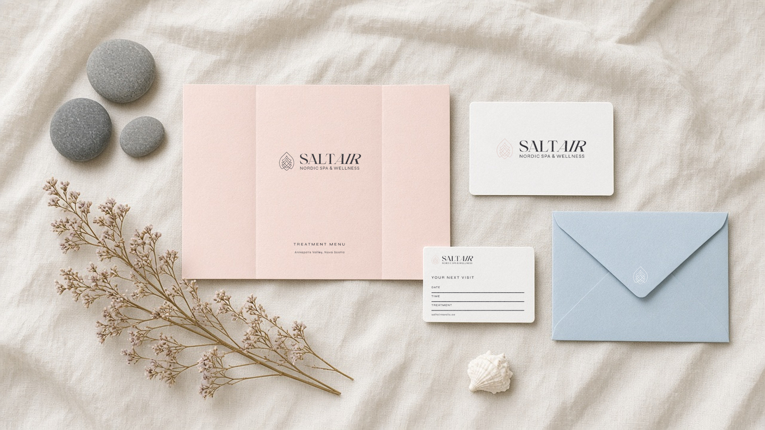
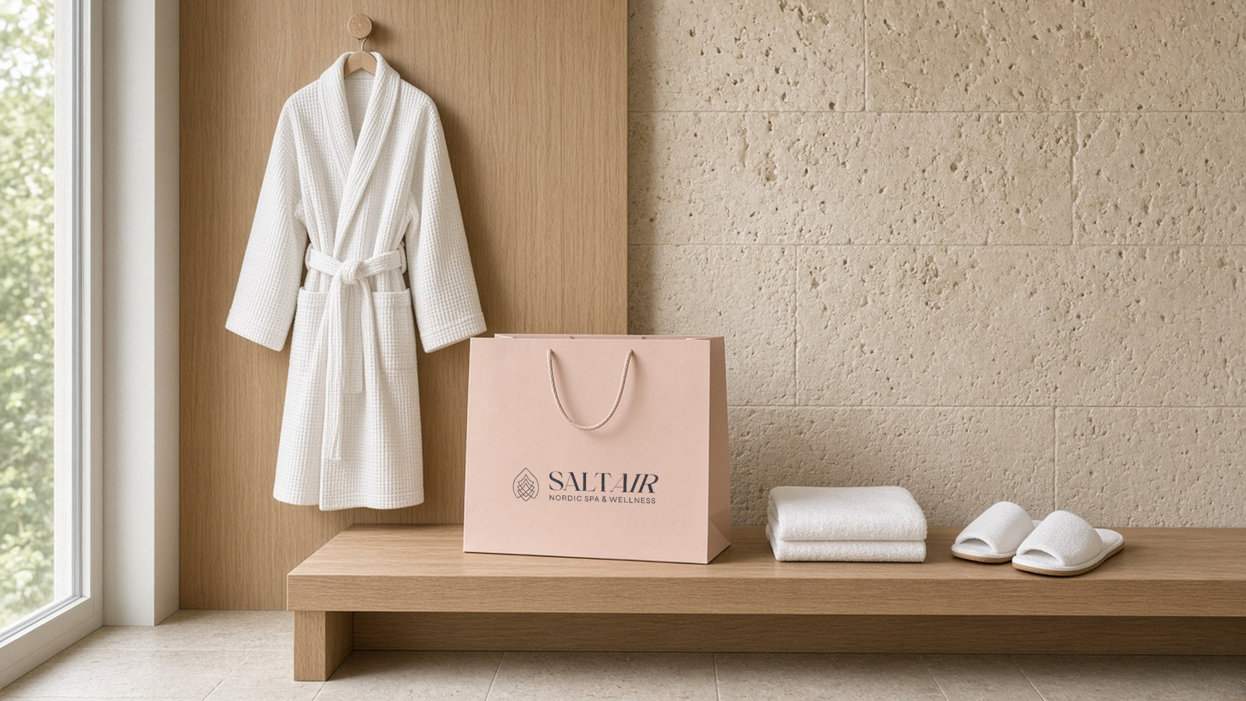
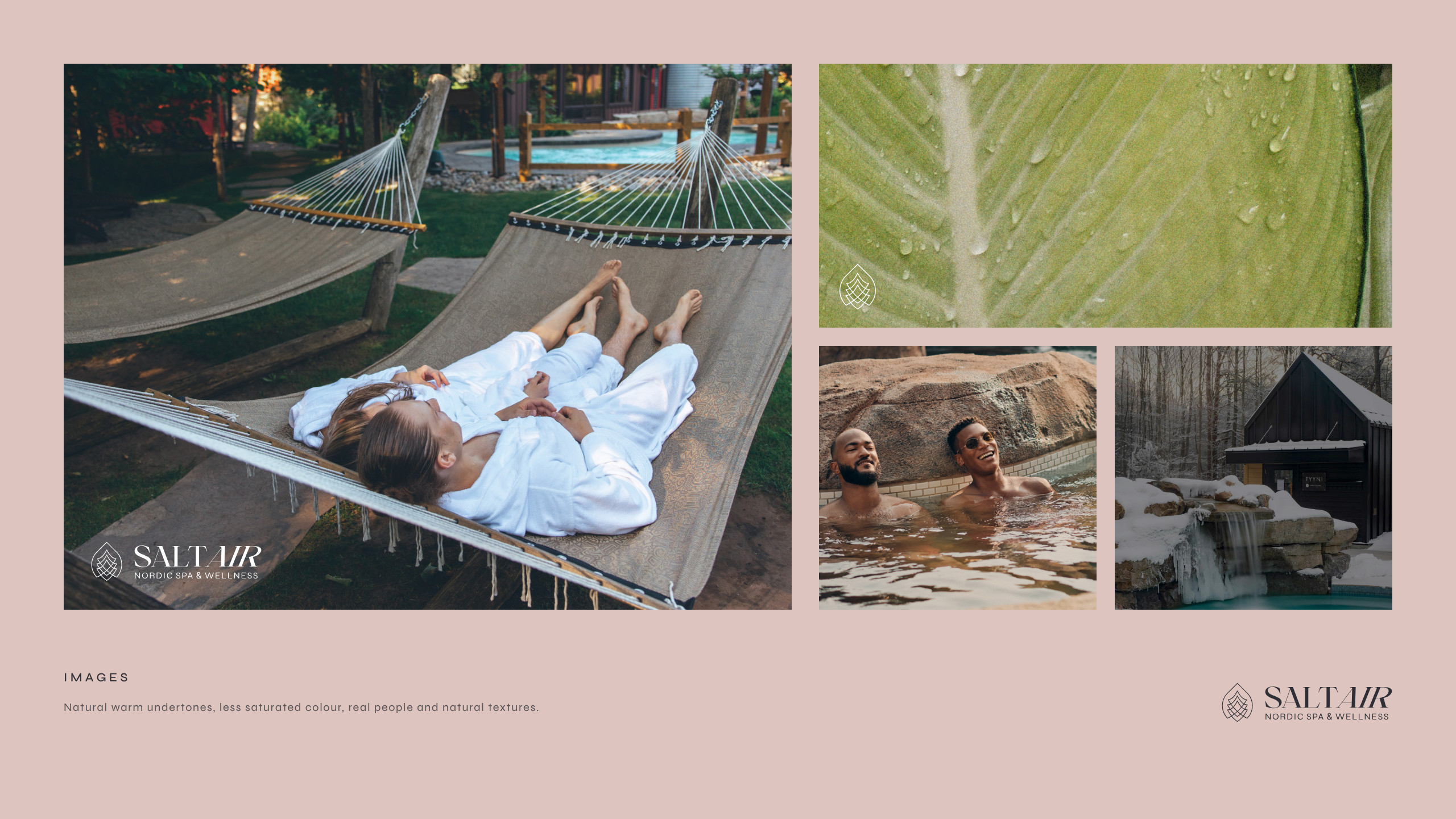
A logo system with a standalone mark and four background versions. Type and hierarchy, a colour palette, stationery, a print and digital grid, image direction and icons.
The brand now has one set of rules for every surface, from stationery to digital. The refreshed brand holds a 4.8/5 positive impression.